The Subtle Science of How Stores Make You Move
You don’t walk through a supermarket randomly. It feels like you do. That’s the trick.
Supermarket movement psychology is built on a simple idea. If a store can influence how you move, it can influence what you notice. And if it can influence what you notice, it can influence what you buy. Everything else flows from that.
Think about your last grocery trip. You probably slowed down near certain shelves without realizing why. You paused in front of displays that weren’t even on your list. Maybe you took a slightly longer path than necessary, doubled back once or twice, or drifted into an aisle you didn’t plan to enter. None of that is accidental.
Retail environments are engineered to shape behavior at a physical level first. Before pricing strategies, before promotions, before even brand preference kicks in. Movement comes first. It’s the foundation layer. If your body moves differently, your brain follows.
This is where supermarket movement psychology becomes powerful. It doesn’t rely on loud signals. No flashing banners screaming for attention. Instead, it works through friction, rhythm, and subtle guidance. Small design choices that feel insignificant in isolation but compound across the entire shopping experience.
A narrow aisle here. A slightly angled shelf there. A display that interrupts your path just enough to make you hesitate. These micro adjustments slow you down at the exact moments the store wants you to pay attention. And that slowdown matters more than most people think.
There’s a direct relationship between time spent in store and money spent. That’s been observed consistently across retail. But stores don’t just want you to stay longer. They want you to move in a very specific way while you’re there. Smooth in some areas. Interrupted in others. Fast when you’re near low-margin essentials. Slow when you’re surrounded by high-margin products.
It ties into other psychological triggers you’ve probably seen before. The mere exposure effect kicks in when you pass the same product multiple times. Decision fatigue makes you more likely to grab convenient options toward the end of your trip. Even the scarcity effect shows up when a crowded display makes something feel popular or in demand.
But none of those triggers activate properly if your movement doesn’t bring you into contact with them.
That’s why supermarket movement psychology isn’t just about layout. It’s about choreography. The store is guiding you, step by step, without ever making it obvious. You feel like you’re in control the entire time. That illusion is essential.
Once you start noticing it, it’s hard to unsee. The pauses. The slow zones. The subtle nudges that steer you left instead of right.
And the interesting part is this. Most of the influence happens in the smallest details. Not the big layout decisions you’d expect, but the micro design choices that shape how you physically move through space.
That’s exactly what we’re getting into next.
Table of Contents
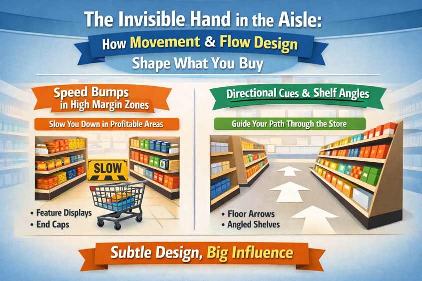
Speed Bumps in High Margin Zones
If you want to see supermarket movement psychology in its purest form, don’t look at the entrance. Don’t look at the checkout. Watch what happens right in front of high margin products.
That’s where stores start messing with your speed.
Not in an obvious way. No signs saying “slow down here.” Nothing that feels forced. But your pace changes anyway. You hesitate. You drift. You pause just long enough to look. And that tiny shift is doing a lot of work.
These “speed bumps” are physical or visual interruptions placed exactly where the store wants your attention. Their job is simple. Break your rhythm.
Because when you’re moving smoothly, you’re efficient. You stick to your list. You ignore distractions. But the moment your movement gets interrupted, your brain switches modes. You stop executing and start noticing.
That’s the opening.
Take a common example. You’re walking down an aisle at a steady pace, scanning only for what you need. Then suddenly, there’s a stack of products slightly jutting into your path. Not blocking you, just enough to make you adjust your trajectory. Maybe you step around it. Maybe you slow down half a second to avoid brushing against it.
That half second matters.
In that moment, your eyes land on the display. Now the mere exposure effect kicks in. You weren’t looking for that product, but now you’ve seen it. And seeing it once makes it easier to justify later. If you pass it again, even better. Familiarity builds fast when your movement keeps getting interrupted in the same zones.
High margin products are almost always placed in these interruption zones. Snacks. Premium items. Ready to eat meals. Things you don’t strictly need but are easy to justify. The store isn’t trying to force a decision. It’s trying to create just enough friction so a decision becomes more likely.
And friction works in both directions. Too much, and it frustrates you. Too little, and you glide past without noticing. Supermarkets tune this carefully. You’ll rarely see a complete obstruction. Instead, it’s controlled inconvenience.
Think about those narrow points in aisles where displays tighten the space. You instinctively slow down because passing someone becomes awkward. Now you’re stuck for a second. What do you do while you wait? You look around. Your attention expands beyond your shopping list.
That’s not a coincidence.
Or those bins filled with discounted or promotional items placed right at intersections. You can’t walk straight through without adjusting. Your path bends slightly. Your speed drops. Your gaze shifts downward, right into the bin. Even if you don’t pick anything up, you’ve engaged with the products.
Supermarket movement psychology relies heavily on these micro interruptions because they feel natural. You don’t question them. You adapt.
There’s also a visual layer to this. Not all speed bumps are physical. Some are perceptual.
Color contrast is a big one. A bright display in a neutral aisle pulls your attention and subtly slows your scan speed. Your brain needs an extra moment to process the difference. That moment is enough.
Lighting does the same thing. A slightly warmer or brighter spot over a premium section creates a visual pause. You don’t consciously think “this area is important,” but your movement reflects it. You slow down, even if just a bit.
Then there’s density. When shelves are tightly packed with products, especially in high margin categories, it increases cognitive load. More options mean more processing. More processing means slower movement. And slower movement increases the chance of a purchase, especially under mild decision fatigue.
You’ve probably experienced this without naming it. Standing in front of a wall of snacks, trying to choose. You weren’t even planning to buy one, but now you’re there, comparing flavors, reading packaging. That entire situation was triggered by a slowdown.
It connects directly to the paradox of choice. Too many options can overwhelm you, but in these contexts, that overwhelm doesn’t always push you away. It often pushes you toward a quick, impulsive decision just to resolve the friction.
And here’s where it gets even more strategic. Speed bumps are often placed right after fast zones.
Staples like milk, bread, or eggs are usually positioned in areas designed for efficient movement. Wide paths. Clear visibility. Minimal interruptions. The store wants you to grab these quickly. Low margin, low dwell time.
But once you leave that zone, the environment shifts. Suddenly, you’re in a space with more obstacles, more visual noise, more reasons to slow down. It’s almost like hitting traffic after a clear highway. Your pace drops whether you like it or not.
That transition is deliberate. It leverages contrast.
When you move from fast to slow, the slowdown feels stronger. More noticeable. And because you were just moving efficiently, you’re less guarded. You haven’t switched into “browsing mode” consciously, but your behavior starts to reflect it.
This is also where impulse buying peaks. You’re no longer focused purely on your list. Your attention has widened. Your decision criteria loosen up. That’s when small indulgences start to make sense.
“I’ll just grab this.”
“It’s not that expensive.”
“Why not.”
Those thoughts don’t appear out of nowhere. They’re triggered by the conditions created through supermarket movement psychology.
Even checkout areas use this principle, but in a compressed form. You’re forced to slow down, often completely stop. Your movement is fully interrupted. That’s why you see high margin, low commitment items there. Gum. Chocolate. Small snacks.
By that point, decision fatigue is already in play. You’ve made dozens of choices. Your resistance is lower. The speed bump becomes a full stop, and the environment is optimized to convert that pause into one last purchase.
What’s interesting is how transferable this idea is beyond supermarkets.
In retail clothing stores, racks placed slightly off alignment slow your path and increase browsing. In e commerce, the equivalent is friction in scrolling. Carousels, pop ups, or recommendation blocks that interrupt your flow and redirect attention. Same principle, different medium.
Break the rhythm, capture attention, increase interaction.
That’s the core.
So next time you’re in a supermarket, pay attention to where you slow down. Not where you choose to, but where it just… happens. Where your pace drops without effort. Where your path shifts slightly.
Those are the engineered moments. The invisible speed bumps doing exactly what they were designed to do.
And once you see them, you realize how much of your shopping experience is shaped before you ever make a conscious choice.
Directional Cues (Floor Arrows, Shelf Angles)
If speed bumps are about slowing you down, directional cues are about steering you without you noticing.
That’s the quieter side of supermarket movement psychology. No friction this time. No interruption. Just gentle guidance. You keep moving, but not entirely on your own terms.
You feel like you’re choosing your path. In reality, the store has already narrowed your options.
Start with something simple. The direction you turn when you enter a store.
In many supermarkets, there’s a subtle bias toward guiding you to the right. It shows up in how entrances are structured, how aisles are aligned, even how the first displays are positioned. Most people, especially in right hand traffic countries, naturally drift right when given a choice. Stores lean into that tendency.
But it rarely looks like an instruction. You won’t see a big arrow saying “go this way.” Instead, the path just feels smoother in one direction. Wider. Less cluttered. More inviting.
That’s enough.
Supermarket movement psychology works best when it doesn’t feel like control. The moment guidance becomes obvious, people resist. So stores rely on cues that operate just below conscious awareness.
Floor arrows are the most direct version of this. You saw them everywhere during periods of crowd control, but even outside those contexts, subtle floor markings still influence behavior. Not everyone follows them strictly, but many adjust their path slightly. Enough to create flow patterns.
And once a flow pattern forms, people tend to follow it. That’s where social proof quietly enters the picture. You see others moving a certain way, so you align without thinking much about it. It feels efficient. Safe. Normal.
Now layer in shelf angles.
Straight shelves create clear, linear movement. You walk past them at a steady pace. But angle those shelves slightly, even just a few degrees, and something interesting happens. Your body adjusts. Your gaze follows the angle. You’re no longer just passing by. You’re being guided toward a focal point.
End caps are a perfect example. They’re rarely flat and passive. They’re angled, layered, sometimes even curved. They pull your attention inward as you approach. You don’t just see them. You drift toward them.
And that drift increases interaction.
Because movement direction and visual attention are tightly linked. Where your body goes, your eyes follow. Where your eyes go, your decisions happen. Supermarket movement psychology connects these steps seamlessly.
There’s also the concept of “line of sight corridors.” Stores design aisles so that certain high value sections are visible from a distance, but not immediately accessible. You see them early, but you have to move through a specific path to get there.
That creates anticipation.
You might spot a colorful produce section or a premium display from afar. It sits just slightly off your direct path. Not far enough to ignore, not close enough to grab instantly. So you adjust your route. Just a bit.
That small adjustment exposes you to more products along the way.
Again, no force. Just positioning.
Another subtle cue is how products are faced and aligned on shelves. Items that are slightly turned outward catch your peripheral vision more easily. Your eyes are drawn to them even if you’re not directly looking. Combine that with slight shelf tilting, and you get a gentle pull effect.
You don’t stop because you decided to. You stop because something caught you.
And that’s enough to trigger engagement.
This ties into attention anchoring. Once your focus lands on a specific product, nearby items benefit from that attention. So stores place high-margin or strategic products exactly where your gaze is likely to land first. The directional cue brings you there. The surrounding products close the sale.
It’s coordinated.
Lighting plays a role here too, but not in an obvious spotlight sense. More like gradients. Brighter zones pull you forward. Slightly dimmer areas recede. You naturally move toward what’s easier to see and process.
Even ceiling height can influence direction. Lower ceilings create a sense of compression, encouraging faster movement through transitional spaces. Higher ceilings open up areas where the store wants you to linger. You move differently depending on how the space feels above you, even if you’re not consciously aware of it.
Now think about intersections inside the store.
Cross aisles are rarely symmetrical. One direction usually feels more “natural” to continue. Maybe the path is a bit wider. Maybe the visibility is better. Maybe there’s a visual anchor pulling you forward. Most people choose that path without hesitation.
That’s how stores maintain flow without needing constant signage.
And once you’re on a guided path, other psychological triggers start stacking.
You pass the same product multiple times through slightly different routes. That reinforces familiarity through repeated exposure. You encounter clusters of “popular” items positioned along high traffic paths, which activates social proof. You hit curated sections where everything feels related, reducing decision effort and increasing basket size.
All of this depends on one thing. You moving where the store wants you to move.
Even small directional nudges can have measurable effects. A slight shift in aisle alignment can increase traffic to a section. A better-placed visual anchor can pull more people toward high margin zones. These are not guesses. Retailers test and refine these layouts constantly.
And the changes don’t need to be dramatic. In fact, subtle works better.
If you suddenly noticed that the store was guiding you, you’d push back. You’d take a different route just to prove a point. That’s human nature. So supermarket movement psychology stays under the radar.
It suggests instead of tells.
You feel like you’re exploring. Browsing freely. Making independent choices.
Meanwhile, your path has been quietly shaped from the moment you walked in.
This same logic shows up outside supermarkets too. In airports, where passenger flow is guided through retail zones before gates. In museums, where exhibit layouts control pacing and attention. In digital products, where interface design nudges users toward certain actions through placement and visual hierarchy.
Different environments. Same principle.
Guide movement, guide behavior.
And here’s the part most people miss. Directional cues don’t just increase exposure. They reduce friction in decision-making.
When your path feels natural, you don’t question it. When you don’t question your path, you don’t question the products you encounter along the way as much either. Everything feels like it belongs. Like it makes sense.
That sense of coherence lowers resistance.
So you keep moving. You keep noticing. You keep adding things to your basket that weren’t there when you walked in.
Not because you were told to. Because you were guided there, step by step, without ever feeling guided at all.
That’s supermarket movement psychology doing its best work.
You Were Never Just Walking Through the Store
You walk in thinking you’ll grab a few things and get out. Ten minutes, maybe fifteen. A clear list. A straight path. That’s the plan.
But supermarket movement psychology doesn’t work with your plan. It works around it.
By the time you reach the checkout, your path has stretched. You’ve slowed down in places you didn’t notice. You’ve drifted toward displays you didn’t intend to see. You’ve picked up items that weren’t on your list, and if someone asked you why, you’d probably come up with a perfectly reasonable explanation.
That’s the part that makes this so effective. Everything feels rational after the fact.
Speed bumps disrupted your rhythm at just the right moments. Directional cues nudged you into paths that increased exposure. Along the way, other triggers quietly layered in. The mere exposure effect made products feel familiar. Decision fatigue lowered your resistance as the trip went on. Small moments of social proof made certain items feel like safe choices.
None of these tactics needed to be loud. None of them needed your full attention.
They just needed your movement.
That’s the real takeaway behind supermarket movement psychology. It operates at a level most people don’t actively monitor. You’re focused on what you’re buying, not how you’re moving. And that gap is where influence lives.
Once you start paying attention to it, the experience changes.
You notice where your pace drops for no clear reason. You see how certain areas seem to “pull” you in. You realize that some paths feel easier, almost automatic, while others feel slightly inconvenient. Those feelings aren’t random. They’re designed.
And here’s where it gets useful.
If you’re a marketer, this gives you a different lens. You stop thinking only in terms of messaging and start thinking in terms of movement. Where do people slow down in your environment? Where do they speed through? Where are they most open to noticing something new?
Those questions apply everywhere. Retail stores, restaurants, showrooms, even digital interfaces. The medium changes, but the principle holds. Interrupt or guide movement, and you shape behavior.
If you’re a shopper, it gives you awareness. Not control, exactly, but clarity.
Next time you’re in a supermarket, try this. Keep your list, but also track your movement. Where did you slow down? Where did you hesitate? What pulled your attention without you planning it? You’ll start to see patterns.
And once you see them, you get a choice.
You can still follow the path, but now you know it’s there.
That small shift in awareness is enough to change how you experience the entire store.

Gabriel Comanoiu is a digital marketing expert who has run his own agency since 2016. He learned marketing by testing, analyzing, and refining campaigns across multiple channels. In his book series Impulse Buying Psychology, he shares the psychological triggers behind every purchase, showing how to create marketing that connects, persuades, and converts.