You Don’t Choose What You See. You See What You’re Meant to Choose.
Walk into any supermarket and you’ll feel like you’re in control. You pick what you like. You ignore what you don’t. Simple, right?
Not really.
Most of what ends up in your basket was decided before you even noticed it. Not by chance. Not by luck. By design.
This is where visual merchandising psychology quietly does its job.
Your brain has limits. It can’t process everything on a crowded shelf, so it filters. Fast. Automatic. Effortless. It looks for shortcuts. Patterns. Signals that say, “this matters” or “this is safe” or “this is popular.” And supermarkets are built around those shortcuts.
They don’t try to show you everything equally. That would be chaos. Instead, they guide your attention. They frame what you see first, what you notice longer, and what feels like the obvious choice. The result? You think you’re browsing… but you’re actually being led.
Ever grabbed the product right in front of you without thinking twice? Or noticed how one item suddenly stands out, even if you weren’t looking for it? That’s not random. That’s attention being engineered.
Visual framing works because attention is selective. And what gets your attention gets your money.
There’s a deeper layer here too. Once something is noticed, other psychological triggers kick in. The price quality heuristic starts whispering that the more expensive option must be better. Social proof nudges you toward what looks popular or prominently placed. Even scarcity can sneak in, making certain products feel limited or special just because of how they’re displayed.
It all starts with attention.
Supermarkets understand something most people underestimate: if they can control what you look at, they can heavily influence what you choose. Not perfectly. Not every time. But often enough to shape patterns, habits, and eventually, loyalty.
And the methods they use aren’t complicated. They’re subtle. Visual. Almost invisible unless you know what to look for.
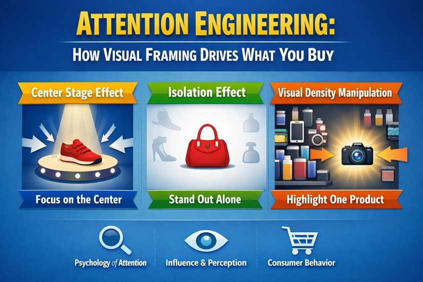
In this article, you’ll see how visual merchandising psychology plays out in real environments. How the center of a display quietly pulls your focus. Why one odd item among many becomes unforgettable. And how something as simple as shelf density can change how expensive or abundant a product feels.
Once you notice these patterns, you won’t unsee them.
Table of Contents
The Center Feels Right (Even When It Shouldn’t)
You walk up to a shelf. Dozens of options. Different brands, sizes, colors. You pause for a second… then your hand goes straight to the middle.
You didn’t scan everything. You didn’t compare carefully. You just picked what felt right.
That instinct is exactly what visual merchandising psychology is built to exploit.
The center stage effect is simple: items placed in the middle of a display get chosen more often. Not because they’re better. Not because they’re cheaper. Because your brain treats the center as the default.
It’s a shortcut. A quiet assumption that says, “this must be the main option.”
Your brain loves defaults. They reduce effort. And in a supermarket, effort is the enemy of speed. You’re not there to run deep analysis on pasta brands. You’re there to get in, get out, and move on. So your brain leans on positioning as a signal.
Center equals important. Center equals popular. Center equals safe.
No sign tells you that. No label confirms it. But it feels true.
And that feeling drives behavior.
Retailers know this. That’s why the most profitable products often sit right in the center of your visual field. Not necessarily the cheapest. Not even the best-selling. The ones with the highest margins.
Eye level plays into this too. There’s a reason people say “eye level is buy level.” Combine that with center positioning and you get a powerful one-two punch. The product is not just visible. It’s unavoidable.
Try this next time you shop. Look at a cereal aisle. The middle shelves, right at eye level, usually feature branded, higher priced products. Store brands or budget options? They’re often pushed lower or off to the sides. Same category. Same function. Completely different attention.
And attention is everything.
There’s also a subtle social layer behind this. Your brain doesn’t just see the center as convenient. It often interprets it as popular. As if the store is quietly saying, “this is what most people choose.” That taps into social proof, another powerful trigger. You’re more likely to go with what feels like the crowd’s choice, even if no actual crowd is visible.
It gets even more interesting when you look beyond supermarkets.
Restaurants do this with menus. Items placed in the center of a page, or in a visually framed box, get ordered more often. Not always the tastiest dishes. Usually the most profitable ones.
Ecommerce sites follow the same playbook. The “recommended” or “featured” product? Almost always centered on the screen. You scroll less. You question less. You click more.
Streaming platforms too. The show placed front and center becomes the one you watch. Not because you researched it. Because it was there, waiting.
Same brain. Same shortcut. Different context.
What makes the center stage effect so effective is that it doesn’t feel like persuasion. There’s no pressure. No urgency. No loud messaging. Just placement.
And placement feels neutral. Objective. Trustworthy.
But it’s anything but neutral.
It’s curated.
Once you start noticing it, you’ll see how often your choices follow your eyes. And how often your eyes are guided before you even realize it.
If you want to counter this, you don’t need to overthink every purchase. Just pause for a second longer. Scan left. Scan right. Give your brain a chance to consider options it would normally ignore.
That tiny shift breaks the automatic pull of the center.
And suddenly, you’re choosing again. Not just reacting.
The One That Breaks the Pattern Wins
Picture a shelf full of identical products. Same size. Same color. Same layout. Your eyes glide over them without really stopping.
Now imagine one of them is bright yellow while everything else is blue.
You notice it instantly.
That reaction is automatic. You didn’t decide to focus on it. It just pulled you in. That’s the isolation effect, often called the von Restorff effect. And inside visual merchandising psychology, it’s one of the most reliable ways to win attention.
Your brain is wired to detect contrast. It looks for what breaks the pattern. Anything that stands out gets priority processing because, from a survival standpoint, difference could mean opportunity or threat. Either way, it matters more than the background.
So when one product looks different, it doesn’t just get seen. It gets remembered.
And in a store, memory drives choice.
Think about a wall of bottled drinks. Mostly transparent bottles, light labels, similar tones. Then one brand uses a matte black bottle with sharp typography. You notice it. You might not buy it immediately, but later, when you’re deciding, that’s the one you recall. Familiarity kicks in, even if that familiarity came from a two-second glance.
That’s enough.
This is where visual merchandising psychology overlaps with the mere exposure effect. The more easily your brain recalls something, the more it tends to trust it. Not because it’s better, but because it feels known.
Retailers and brands use this constantly.
Sometimes it’s color. One package breaks away from the category norm. In a sea of green “healthy” snacks, a bold red package suddenly feels energetic, maybe even indulgent. Different positioning, different audience, same shelf.
Sometimes it’s shape. Most products follow standard packaging because it’s efficient. But one unusual shape cuts through the noise. Think of a uniquely curved bottle or an asymmetrical box. It interrupts your scanning pattern.
Sometimes it’s whitespace. This one’s subtle. Instead of cramming the design with claims and visuals, a brand leaves space. Clean. Minimal. On a crowded shelf, that emptiness becomes the contrast. It feels calm. Premium. Intentional.
Luxury brands lean heavily on this. They don’t compete with noise. They step away from it.
And that ties into another trigger you’ve probably noticed: scarcity.
When something looks different and less cluttered, your brain sometimes reads it as less available. More exclusive. Even if the stock behind it says otherwise. That perception alone can increase its appeal.
Here’s where it gets interesting. Standing out doesn’t always mean loud.
Most people assume contrast means brighter, bigger, more aggressive. Sometimes that works. But in a high-noise environment like a supermarket, doing the opposite can be even more effective.
If everything is shouting, the quiet one gets heard.
This shows up in other industries too.
Online ads that blend into content used to perform better because they avoided “banner blindness.” Then users adapted. Now, ads that break the layout again regain attention. It’s a constant cycle of pattern and disruption.
On social media, a simple post with plain text can outperform a polished graphic. Why? Because it looks different from everything else in the feed.
In fashion retail, a single item placed on a mannequin surrounded by racks of clothes suddenly feels curated. Important. Worth a closer look.
Same principle. Different execution.
But there’s a catch.
If everything tries to stand out, nothing does.
When too many products use bright colors, unusual shapes, or bold claims, the shelf resets. The new pattern becomes chaos. And your brain goes back to filtering aggressively, often defaulting again to shortcuts like the center stage effect or familiar brands.
That’s why effective use of the isolation effect requires restraint. It works best when it’s rare. Intentional. Strategic.
From your side as a shopper, the awareness changes how you interpret what you see.
That product that “caught your eye”? It might not be better. It might just be different.
And different feels like important.
If you slow down for a second, you can ask a simple question: would I still choose this if it looked like everything else?
Sometimes the answer is yes. Often, it’s not.
That gap between attention and actual value is exactly where visual merchandising psychology does its work.
When More Feels Cheaper and Less Feels Expensive
Look at two displays.
One is packed. Products stacked tightly, almost overflowing. Labels overlap. Shelves feel busy, maybe even a bit chaotic.
The other is clean. Fewer items. Space between each product. Everything looks… intentional.
Same category. Sometimes even similar prices.
Yet they feel completely different.
This is visual density manipulation, one of the quieter levers in visual merchandising psychology. It shapes how you perceive value before you even look at the price tag.
Your brain uses density as a shortcut. High density signals abundance. Low density signals scarcity. And those signals come with built-in assumptions.
Abundance feels cheap. Scarcity feels expensive.
No one tells you that directly. You just feel it.
When shelves are tightly packed, your brain reads it as “there’s plenty of this.” That reduces perceived value slightly. If something is everywhere, it can’t be that special, right? It also creates a subtle expectation of lower prices. Discount stores lean heavily on this. Bulk bins, stacked pallets, crowded shelves. The message is clear without saying a word: you’re getting a deal.
And often, you don’t even check too closely. The visual cue does the work.
Now flip it.
A sparse display does the opposite. Fewer items. More breathing room. Suddenly, each product gets its own stage. It feels curated. Selected. Premium.
Even if the product itself hasn’t changed.
Luxury brands understand this deeply. They don’t flood you with options. They slow you down. They give each item space to exist. That space creates focus, and focus increases perceived importance.
It also increases perceived price tolerance.
You’re more willing to accept a higher price when the environment suggests exclusivity. That’s not accidental. It’s the same logic behind high-end boutiques that display one handbag per shelf instead of twenty.
Supermarkets borrow this tactic too, especially in premium or organic sections. You’ll often see fewer items per shelf, cleaner layouts, softer lighting. It subtly separates those products from the rest of the store.
Same building. Different perception.
There’s also a cognitive load factor here.
Dense displays overwhelm your brain. Too many options, too little time. So you simplify. You either grab something quickly or rely on other shortcuts like familiar brands or center positioning.
Sparse displays reduce that pressure. Fewer choices feel easier to process. That ease often translates into a better experience, which then gets associated with the product itself.
So now, it’s not just about price perception. It’s about emotional comfort.
And comfort sells.
This connects with another trigger you’ve probably felt: the paradox of choice. When there are too many options, decision quality doesn’t improve. It often drops. You either delay the decision or pick something random just to move on.
Dense shelves push you toward that fast, low-effort decision.
Sparse shelves invite slower, more deliberate choices.
Retailers use both depending on what they want from you.
High turnover products? Go dense. Move volume. Encourage quick grabs.
High margin products? Go sparse. Slow the process. Increase perceived value.
You’ll see this contrast even within the same store. The snack aisle might feel packed and noisy, pushing impulse buying. A nearby premium chocolate section might suddenly feel calm and spaced out, nudging you toward a more “considered” purchase that just happens to cost more.
Same shopper. Different behavior. Controlled by environment.
And then there’s the illusion layer.
Sometimes density doesn’t reflect actual stock levels. Shelves are faced forward, products pulled to the edge, gaps hidden. It looks full even when it’s not. That maintains the perception of abundance, which keeps the price expectations stable.
On the flip side, a limited number of items placed with lots of space can exaggerate scarcity. Even if there’s more stock in the back, what you see suggests limitation.
And limitation triggers urgency.
Not loud urgency like countdown timers. Quiet urgency. The kind that makes you think, “maybe I should grab this now.”
From your side, this is one of the easiest tactics to overlook because it feels like store aesthetics rather than strategy.
But it’s doing real work.
Next time you’re shopping, pause and look at how products are spaced. Ask yourself what the layout is trying to signal. Cheap and abundant? Or premium and rare?
Once you see it, you’ll notice how often your perception of value starts forming before you ever read the price.
That’s visual merchandising psychology doing exactly what it’s supposed to do.
You Were Looking. They Were Directing.
You walked into the store thinking you’d make a few simple choices.
But by now, you’ve probably realized something slightly uncomfortable. Your choices didn’t start with logic. They started with attention. And attention was never neutral.
That’s the real power of visual merchandising psychology.
It doesn’t force you to buy anything. It doesn’t need to. It quietly shapes what you notice, what you remember, and what feels right. And once something feels right, you rarely question it.
The center pulls you in because it feels like the default.
The standout product sticks because your brain can’t ignore contrast.
The spacing around items quietly tells you what’s cheap and what’s premium.
None of these tactics scream for attention. That’s exactly why they work.
They operate below conscious awareness, where most buying decisions actually happen.
And once you see how these pieces fit together, something clicks. You start noticing how often your “preferences” are influenced before you even form them. That product you reached for first? It was placed there. That item you remembered later? It was designed to stand out. That premium choice you justified? It was framed to feel worth it.
This doesn’t mean you’re being manipulated in some extreme way. It means you’re human. Your brain uses shortcuts. Retail environments are built around those shortcuts.
That’s the game.
And like any game, once you understand the rules, you play differently.
You slow down just enough to scan beyond the center.
You question why something stands out instead of assuming it deserves to.
You notice when space is being used to signal value instead of reflecting it.
Small shifts. But they change how you decide.
There’s also a practical upside if you’re on the other side of the equation. If you’re building a brand, designing a store, or even setting up a product page, this is where real leverage sits.
You don’t need louder messages. You need better placement.
You don’t need more options. You need smarter contrast.
You don’t need to change the product. Sometimes, you just need to change how it’s seen.
That’s the uncomfortable truth and the opportunity at the same time.
Because in the end, people don’t choose what’s best.
They choose what they notice.
And what they notice is rarely an accident.

Gabriel Comanoiu is a digital marketing expert who has run his own agency since 2016. He learned marketing by testing, analyzing, and refining campaigns across multiple channels. In his book series Impulse Buying Psychology, he shares the psychological triggers behind every purchase, showing how to create marketing that connects, persuades, and converts.