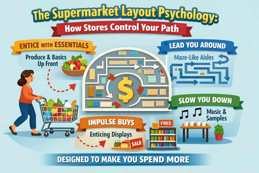
The Psychology Behind Supermarket Layouts
Walk into a supermarket and it feels simple. You grab a cart, pick what you need, maybe wander a bit, then head to checkout. It feels like you’re in control. But that feeling? It’s carefully engineered.
Supermarket layout psychology is built on one core idea: the longer you stay, the more you buy. That’s not a guess. It’s a probability game. If you spend 10 minutes in a store, you’ll likely stick to your list. Stretch that to 25 minutes, and suddenly a chocolate bar, a scented candle, and a “why not” bottle of juice sneak into your cart. Nothing random about it.
Retailers design spaces the same way marketers design funnels. Every step, every turn, every visual cue nudges you forward. Not aggressively. Subtly. Quiet enough that you don’t notice, but consistent enough that your behavior shifts anyway.
Think about the last time you went in for one thing and walked out with five. You probably didn’t stop and ask yourself, “Why did I even go down that aisle?” That’s the point. Good layout doesn’t force decisions. It creates conditions where certain decisions feel natural.
There’s a mix of psychological triggers working together here. Decision fatigue plays a role. The more choices you make, the less resistant you become to impulse buys. Sensory cues matter too. Lighting, spacing, even the absence of distractions like windows or clocks. Then there’s product placement psychology. Eye-level shelves, end caps, and strategic grouping all feed into the same system.
And here’s where it gets interesting. None of these tactics work in isolation. A supermarket isn’t just using one trick. It’s layering them. Layout guides your movement. Music slows your pace. Promotions catch your attention at just the right moment. Scarcity cues whisper urgency. Before you realize it, your “quick stop” has turned into a full browsing session.
You’re not being manipulated in an obvious way. You’re being guided. Nudged. Influenced in small increments that add up.
Once you start noticing supermarket layout psychology, it’s hard to unsee. The empty space at the entrance. The way essentials are never where you expect them. The subtle pull to turn right. It all starts to look less like a store and more like a carefully designed experience.
And that’s exactly what it is.
Table of Contents
No Windows, No Clocks: How Stores Quietly Remove Time
Walk into most supermarkets and try to answer a simple question: what time is it?
You can’t. Not easily, anyway.
There are no windows. No natural light shifts throughout the day. No wall clocks. No subtle cues that tell your brain, “Hey, you’ve been here a while.” That absence isn’t an oversight. It’s one of the cleanest examples of supermarket layout psychology in action.
Because once you lose track of time, something interesting happens. Your internal pacing breaks.
Normally, when you shop with time awareness, you move differently. You think in constraints. You speed up. You skip aisles. You make sharper decisions. But remove that awareness, and your behavior softens. You drift a bit. You browse longer than you planned. You stop “shopping” and start exploring.
And that’s exactly where unplanned purchases begin.
There’s a direct relationship here that you can test yourself. More time in store increases exposure to products. More exposure increases the chance of something catching your attention. And attention is the first step toward buying.
Think of it like this:
If you walk past 50 products, maybe 2 or 3 trigger interest.
If you walk past 300 products, that number jumps.
No pressure needed. Just probability doing its job.
Supermarkets don’t need you to buy everything. They just need a few extra yes decisions. A snack you didn’t plan. A drink that “looks refreshing.” A promotion that feels like a smart deal. Those small additions scale across thousands of customers every day.
And without time awareness, you don’t feel those decisions stacking up.
There’s also a deeper layer here. When your brain isn’t tracking time, it has more capacity for other inputs. Visual stimuli. Promotions. sensory cues like lighting and color contrasts. Even music plays into this. Slower tempos subtly reduce your walking speed. You don’t notice it, but your body does. You linger a second longer at each shelf. That second compound across the store.
Now, combine that with decision fatigue.
Every choice you make, even small ones like picking between two brands of pasta, drains a bit of mental energy. Early in your visit, you’re sharp. Focused. You stick to your list. But as time passes, especially when you’re not aware of it passing, your resistance drops.
That’s when impulse buying becomes easier.
You’ve probably felt this. At the start, you ignore the candy aisle. Ten minutes later, it doesn’t seem like a big deal. Twenty minutes in, throwing something extra into your cart feels almost justified. “It’s just one thing.” Except it rarely is.
Supermarket layout psychology leans heavily on this pattern. It stretches your time without you realizing it, then places tempting decisions right when your guard is lower.
And here’s the part most people miss. The lack of windows doesn’t just remove time cues. It removes context.
You don’t see the weather outside. You don’t see if it’s getting dark. You’re disconnected from your environment. Inside the store, everything is controlled. Lighting stays constant. The temperature stays comfortable. It’s a kind of artificial bubble designed to keep your attention inward.
Compare that to a small local shop with street-facing windows. You feel time passing. You stay anchored to the outside world. You get in and out faster. Big supermarkets don’t want that.
They want immersion.
This tactic also works quietly with others. The decompression zone at the entrance helps you adjust to the environment. The right turn bias pulls you into high-margin areas early. The maze-like layout keeps you moving through multiple categories. But none of those work as well if you’re constantly aware of time ticking.
So they remove it completely.
No reminders. No urgency. Just a smooth, continuous experience where minutes blur together.
And the longer you stay inside that system, the more likely you are to spend beyond your plan.
It’s not force. It’s not even persuasion in the traditional sense.
It’s design doing the heavy lifting.
Single Main Entrance and Exit Path: The Controlled Journey
Try this next time you’re in a supermarket. Walk in, grab what you need as fast as possible, and head straight to the exit.
Sounds simple. It rarely is.
You’ll notice something almost immediately. The path isn’t designed for efficiency. It’s designed for exposure. That single main entrance and exit path is one of the most reliable tools in supermarket layout psychology, and once you see it, it’s hard to ignore.
You’re not just entering a store. You’re entering a controlled route.
Most large supermarkets funnel you through a defined starting point and guide you along a loosely structured path before you can leave. It’s not always obvious like a maze with walls, but the effect is similar. Aisle orientation, shelving angles, promotional displays, even cart flow all push you in certain directions.
And shortcuts? They exist, but they’re inconvenient enough that most people don’t take them.
Why does this matter?
Because every extra meter you walk increases product exposure. And exposure is the raw material of impulse buying.
Let’s break it down in practical terms.
Say you walk in for milk and bread. In a perfectly efficient layout, those items would be near the entrance. You’d grab them and leave in two minutes. But supermarkets don’t optimize for your time. They optimize for your basket size.
So essentials are placed deeper inside. You’re forced to pass through multiple categories to reach them. Snacks. Drinks. Seasonal items. Promotions. Each one is a chance to interrupt your original plan.
And the entrance path plays a key role in setting this up.
Right after you step in, your movement is gently guided. Wide aisles narrow slightly. Displays create visual barriers that nudge your direction. Your cart follows the easiest path, which is usually the one the store wants you to take.
You’re not thinking, “I’m being directed right now.” You’re just walking.
That’s the subtlety of supermarket layout psychology. It removes friction from the path they want, and adds friction to the paths they don’t.
Even small design choices matter here. End caps at the end of aisles act like visual magnets. Your eyes go there first. Once your attention is captured, your body follows. Cross-aisles exist, but they’re often less visually inviting. You can cut through, sure, but it doesn’t feel like the natural flow.
So most people stay on the main route.
And the longer you stay on that route, the more decisions you’re asked to make.
Here’s where another trigger slips in: choice overload.
You weren’t planning to compare five brands of cereal. But now you’re there, looking at them. Bright packaging, price tags, discount labels. Your brain engages. Even if you don’t buy cereal, you’ve spent time and mental energy.
Multiply that across the store, and something shifts. Your shopping trip becomes a series of micro-decisions instead of a simple task. And as those decisions stack up, your resistance to adding extra items weakens.
The single entrance and exit path amplifies this effect by controlling the sequence of those decisions.
It’s not random which categories you encounter first. High-margin products often show up early, when your attention is fresh. Staple goods come later, once you’re already committed to the journey. By the time you reach them, you’ve likely picked up a few extras along the way.
And leaving? That’s controlled too.
Checkout areas are rarely direct exits. You’re funneled through narrow lanes filled with last-minute temptations. Candy, drinks, small snacks, and convenience items. This is where decision fatigue peaks. You’ve made dozens of choices already. Your brain is tired. Grabbing one more thing feels insignificant.
That’s not a coincidence. It’s timing.
The entire path, from entrance to exit, is designed as a sequence. Each step builds on the previous one. Each section increases the likelihood that you’ll deviate slightly from your plan.
And here’s the part worth noticing.
You still feel free.
You can turn around. You can skip aisles. You can walk faster. Nothing is physically stopping you. But the environment makes certain behaviors easier and others just inconvenient enough to avoid.
That’s the sweet spot of supermarket layout psychology. Control without pressure.
You’re guided, not forced.
Compare this to a small convenience store where you can see everything from the entrance. You walk in, grab your item, and leave. No journey. No sequence. No prolonged exposure. Your basket stays small because the system doesn’t expand it.
Large supermarkets do the opposite. They stretch the journey. They layer decisions. They increase exposure step by step.
And that single entrance and exit path is what makes the whole system hold together.
Without it, the experience falls apart. With it, every customer walks through a carefully designed opportunity to spend more than they intended.
Decompression Zone at the Entrance: The Quiet Reset Before You Buy
Right after you walk into a supermarket, something feels… different.
You’re inside, but you’re not really shopping yet.
Look around. The first few meters are often open, calm, sometimes almost empty. Maybe a few large displays. Maybe seasonal items spaced far apart. But compared to the rest of the store, it feels underwhelming.
That’s not wasted space. That’s the decompression zone. And it’s one of the most overlooked pieces of supermarket layout psychology.
Here’s what’s happening.
When you step from outside into a store, your brain is still processing the transition. Light changes. Temperature shifts. Sounds change. Your eyes adjust. Your attention is scattered for a few seconds. You’re not ready to notice products, compare prices, or make decisions yet.
So anything placed right at the entrance? It gets ignored.
Retailers know this. They’ve tested it. Products placed too close to the entrance consistently underperform. People walk past them without really seeing them. It’s not that the products are bad. It’s that your brain hasn’t “arrived” yet.
So instead of fighting that reality, supermarkets design around it.
They give you space.
The decompression zone acts like a buffer. A short reset period where your senses calibrate. Your pace stabilizes. Your attention narrows. You shift from “moving through space” to “engaging with the environment.”
And once that shift happens, everything changes.
Now you start noticing things.
Colors pop more. Signs register. Promotions catch your eye. Your brain moves from passive to active mode. And that’s exactly when supermarkets begin placing high-impact products.
There’s a timing element here that’s easy to miss.
If a promotion appears too early, it’s wasted. Too late, and you might already be focused on your list. But right after the decompression zone? That’s the sweet spot. Your attention is fresh, but now it’s also directed.
That’s where you’ll often find bold displays. Seasonal offers. High-margin items. Products designed to trigger curiosity or emotion.
And here’s where other psychological triggers start layering in.
Visual contrast plays a big role. After a relatively empty entrance, a well-designed display feels more noticeable. Your brain picks up the difference instantly. It’s the same principle used in advertising. Contrast creates attention.
There’s also an element of priming.
What you see first after the decompression zone can shape your entire shopping mindset. If you’re greeted with fresh produce, you might feel like you’re making healthy choices. That mindset can carry through the store, even if you later grab less healthy items. If you see discounts first, your brain shifts into deal-hunting mode.
It’s subtle, but it sticks.
And then there’s pace control.
The decompression zone doesn’t just reset your attention. It slows you down. You naturally adjust your walking speed as you enter. You’re not rushing yet. You’re easing in. That slower pace carries forward, especially when combined with other tactics like wider aisles at the entrance and music with a lower tempo.
Slower pace means more time per aisle. More time per aisle means more product exposure. And we’re back to that same core principle driving supermarket layout psychology.
More exposure increases the chance of unplanned purchases.
You can test this yourself.
Walk into a store and deliberately try to engage with products immediately at the entrance. It feels unnatural. Your brain resists it. Now walk a few meters further in. Suddenly, it’s easier to focus. You start reading labels, noticing prices, comparing options.
That shift is the decompression zone doing its job.
What’s interesting is how consistent this tactic is across different retail environments.
High-end clothing stores use it. Electronics stores use it. Even hotels and showrooms apply the same principle. They don’t overwhelm you at the door. They let you arrive first, then guide your attention once you’re ready.
Supermarkets just execute it with precision because their margins depend on small behavioral shifts at scale.
And it connects directly with everything else you’ve seen so far.
The single entrance path brings you in. The lack of windows removes time pressure. The decompression zone resets your brain. Then the real selling begins, right when your attention peaks.
It’s a sequence.
Miss one part, and the system weakens. Get it right, and you barely notice it’s happening.
That’s the pattern you’ll keep seeing with supermarket layout psychology. It’s not about one big trick. It’s about small, well-timed adjustments that guide your behavior step by step.
And the decompression zone? That’s the quiet moment where the whole process begins.
Right Turn Bias: Why You Almost Always Go That Way
Walk into a supermarket and don’t think. Just move.
Chances are, you’ll turn right.
Not because of a sign. Not because someone told you to. It just feels… natural. And that instinct is exactly what supermarket layout psychology builds on.
The right turn bias is one of those small behavioral patterns that seems insignificant on its own, but becomes powerful when you design around it. Most people, especially in countries where traffic flows on the right, tend to drift right when entering a space. It’s tied to spatial habits, body orientation, even how we navigate crowds.
Retailers didn’t invent this. They observed it. Then they turned it into a system.
Because if you can predict where people go in the first few seconds, you can control what they see first.
And what you see first matters more than you think.
Early exposure shapes perception. It sets the tone for your entire shopping experience. If the first thing you encounter feels appealing, premium, or exciting, your brain carries that impression forward. It subtly raises your willingness to spend.
That’s why the right side of the entrance path is prime real estate.
This is where you’ll often find high-margin products. Promotions. Seasonal displays. Items with strong visual appeal. Fresh produce arranged to look vibrant. Ready-to-eat foods. Flowers. Anything that creates a positive, immediate impression.
It’s not random placement. It’s strategic timing.
Right after the decompression zone, your attention sharpens. You’re now fully “in” the store. And since most people naturally turn right, that path becomes the first real opportunity to influence buying behavior.
So retailers stack the odds in their favor.
Let’s make this practical.
Imagine two identical products. Same price. Same quality. One is placed on a secondary aisle you may or may not visit. The other sits along the right-hand path you’re almost guaranteed to take.
Which one sells more?
It’s not even close.
Exposure beats intention more often than people realize.
You might walk in with a list, but your brain is still highly responsive to what it sees first. That initial path acts like a soft filter. It introduces options you didn’t plan for, and once an idea is planted, it’s hard to completely ignore.
“Maybe I’ll grab this later.”
That thought alone increases the chance you actually will.
And here’s where things get layered again.
The right turn bias doesn’t work in isolation. It connects with visual merchandising, product placement, and even pricing strategies. Items placed here are often not just high-margin, but also easy to justify. Small luxuries. Treats. Convenience products. Things that don’t require deep thinking.
Because early in your shopping trip, your decision energy is still high, but your guard isn’t fully up yet.
You’re open.
Retailers take advantage of that openness by presenting options that feel low-risk. A fresh juice. A bakery item. A “limited time” offer. These aren’t big commitments, but they set a pattern. Once you add one unplanned item to your cart, the next one becomes easier.
Momentum builds.
There’s also a physical component people don’t notice.
When you turn right, your body naturally aligns with the store’s main flow. You’re now moving with the intended traffic pattern. That reduces friction. You don’t need to think about where to go next. The layout carries you forward.
If you try to go left instead, it often feels slightly off. Not wrong, just less intuitive. Maybe the aisle is narrower. Maybe the displays aren’t as inviting. Maybe other shoppers are coming toward you. Small signals, but enough to make you reconsider.
So most people stick with the right-hand path.
And that consistency is what makes the tactic reliable.
From a supermarket’s perspective, predictability is gold. If you know how the majority of customers will move, you can place products with precision. You can control visibility. You can influence the order in which decisions happen.
It turns a random shopping trip into a structured experience.
What’s interesting is how transferable this idea is.
You see it in shopping malls, where anchor stores are positioned to guide foot traffic. In websites, where key elements are placed along natural eye-scanning patterns. Even in restaurants, where menu layouts steer attention toward specific dishes.
Same principle. Different environment.
Guide the first move, and you shape everything that follows.
In supermarkets, that first move is often a simple right turn.
You don’t notice it. You don’t question it. But from that moment on, your path, your attention, and your decisions are a little less random than they seem.
And a little more profitable for the store.
Maze-Like Layout: Why You Never Take a Straight Path
Walk into a large supermarket with a clear goal. Milk, eggs, bread. Simple.
Now try to get in and out in under three minutes.
You won’t. Not because you’re slow. Because the store isn’t built for that.
This is where supermarket layout psychology becomes impossible to ignore. The maze like layout, sometimes subtle, sometimes obvious, is designed to stretch your path and multiply the number of decisions you make before you reach what you came for.
You’re not just shopping. You’re navigating.
In many large stores, essentials are placed far from the entrance. Milk at the back. Bread somewhere deep inside. Eggs in a corner that forces you through at least two or three categories first. You don’t walk directly to them. You pass snacks, drinks, ready meals, promotions, household items.
That’s not poor organization. That’s deliberate sequencing.
Because every extra category you pass through is another opportunity to interrupt your plan.
Let’s break the mechanics.
If a store lets you move in straight lines, your behavior stays focused. You enter, go directly to your target, and leave. Minimal exposure. Minimal distraction. Small basket.
A maze like layout does the opposite. It breaks direct paths. It bends your route. It forces you into longer loops. Even when you think you’re taking a shortcut, you often end up in another aisle you didn’t plan to visit.
And each detour comes with new stimuli.
Bright packaging. discount signs. bundle offers. Items placed at eye level. It only takes one of these to catch your attention and slow you down. Once you slow down, you engage. Once you engage, you consider. And once you consider, buying becomes a real possibility.
It’s a chain reaction.
What makes this powerful is that it doesn’t feel forced. You’re not being stopped. You’re just being guided through a space where the most efficient route is rarely the most obvious one.
And while you’re navigating, something else is happening in the background.
Your original intention starts to fade.
At the start of your trip, your goal is clear. But as you move through multiple categories, your brain keeps switching contexts. Food, cleaning supplies, snacks, drinks. Each shift pulls your attention in a new direction. Your mental “shopping list” becomes less dominant.
This is where impulse buying thrives.
You see something, and it feels relevant in that moment, even if it wasn’t part of your plan. A promotion triggers urgency. A bundle offer suggests value. A familiar brand creates comfort. These are classic psychological triggers, and the maze like layout ensures you encounter as many of them as possible.
There’s also a physical dimension to this.
Longer paths mean more time on your feet. More time in the store increases decision fatigue. And as you’ve already seen, decision fatigue lowers resistance. By the time you reach the essentials at the back, you’ve already made dozens of micro-decisions.
At that point, adding one more item doesn’t feel significant.
Now layer this with the exit path.
After collecting what you came for, you don’t just walk straight out. You’re guided back through additional aisles or along the store perimeter. Fresh temptations appear again. Checkout zones add another layer of last-minute decisions.
The journey doesn’t end when you find your item. It ends when the store lets you leave.
That’s the key difference between a functional layout and a strategic one.
A functional layout helps you complete your task quickly. A strategic layout maximizes the number of interactions you have before completing it.
And supermarkets are firmly in the second category.
You’ll notice variations of this approach across different formats. Some stores use a strict forced path, where you follow a clear route from start to finish. Others use a more open layout but still position key categories in a way that creates indirect movement.
Different execution, same goal.
Increase exposure. Increase decisions. Increase the chance that your final basket looks nothing like your original plan.
And here’s the part that sticks with you once you notice it.
You can’t fully “opt out” of this system. You can move faster. You can stick to your list. But the environment still shapes your experience. It still presents options. It still nudges your behavior, even if you resist some of it.
That’s the strength of supermarket layout psychology.
It doesn’t rely on one big push. It builds pressure gradually, through structure, movement, and repetition.
So the next time you find yourself walking past five things you didn’t intend to see just to reach one thing you need, it’s not inefficient design.
It’s working exactly as intended.
Conclusion: You’re Not Just Shopping, You’re Being Guided
By now, the pattern is clear.
Supermarket layout psychology isn’t about one clever trick. It’s a system. A sequence. A carefully built environment where each step quietly increases the chance that you spend more than you planned.
You walk in through a single entrance that sets your path.
You pass through a decompression zone that resets your attention.
You naturally turn right, where high-margin products are waiting.
You move through a maze like layout that stretches your journey.
And all of it happens in a space where time feels… irrelevant.
None of these tactics force you to buy.
But together, they make buying easier.
That’s the distinction that matters.
At no point does the store take control away from you. You can still stick to your list. You can ignore promotions. You can move fast. But the environment is designed to work against those intentions, gently, consistently, and at scale.
And it works because it aligns with how your brain already behaves.
You respond to visual contrast.
You slow down in comfortable environments.
You get mentally tired after repeated decisions.
You become more open to small, low-risk purchases over time.
Supermarkets don’t fight these tendencies. They design around them.
That’s why supermarket layout psychology shows up in other places too. Retail stores, online shops, even apps follow similar patterns. Guide the path. Control exposure. Time decisions carefully. Reduce friction where you want action, increase it where you don’t.
Once you see it, you start noticing it everywhere.
So what do you actually do with this?
You don’t need to overthink every shopping trip. But awareness changes behavior in subtle ways. If you know the layout is stretching your path, you can move with more intention. If you recognize when your attention peaks, you can be more selective. If you feel decision fatigue creeping in, you can pause instead of adding one more item.
Small adjustments. That’s enough.
Because the system isn’t trying to trick you once. It’s trying to influence you repeatedly, in small moments that feel insignificant on their own.
And those moments add up.
At the end of the day, supermarkets aren’t just selling products. They’re designing experiences that shape how you move, what you notice, and what you decide.
You walk in thinking you’re just buying groceries.
But the layout has already started working on you.

Gabriel Comanoiu is a digital marketing expert who has run his own agency since 2016. He learned marketing by testing, analyzing, and refining campaigns across multiple channels. In his book series Impulse Buying Psychology, he shares the psychological triggers behind every purchase, showing how to create marketing that connects, persuades, and converts.