You Think You’re Choosing… But the Store Chose First
Walk into a supermarket and you probably think you’re making rational choices. You grab what you need, compare a few prices, maybe glance at labels. Feels straightforward. But the truth is, a lot of those decisions are quietly shaped before you even reach for a product.
That shaping has a name: product placement in supermarkets.
It’s not random. It’s not just about fitting items on shelves. Every product you see, and more importantly, every product you don’t notice, has been positioned with intent. Retailers and brands study how you move, where your eyes go, what slows you down, and what nudges you to act without thinking too hard. Then they design the environment around those patterns.
Think about the last time you walked into a store “just for milk” and left with a full basket. That didn’t happen by accident. You were guided. Subtly, yes, but consistently.
Supermarkets rely on a mix of psychological triggers to make this work. Decision fatigue plays a role. The more choices you face, the more likely you are to default to what’s easiest to grab. Visual hierarchy matters too. Your eyes don’t scan shelves evenly. They follow predictable paths, and stores take advantage of that. Then there’s impulse buying, which kicks in when something feels convenient, familiar, or just slightly urgent.
Product placement sits right at the center of all this.
It connects physical space with human behavior. It turns shelves into silent salespeople. And it often works better than advertising because it catches you at the exact moment you’re ready to buy. No need to convince you from scratch. You’re already there, wallet half open, decision mode activated.
What makes this especially effective is how invisible it feels. You don’t notice the strategy, only the outcome. You think you chose the product because it made sense. Maybe it did. But chances are, it was also the easiest option to notice, reach, and justify in that moment.
And here’s where it gets interesting. Once you start seeing how product placement in supermarkets works, you can’t really unsee it. You begin to notice patterns. Why certain brands dominate eye level. Why promotions cluster at aisle ends. Why essentials are never where you expect them.
We’re going to break it down piece by piece. Not in a textbook way, but in the way you actually experience it while pushing a cart, slightly distracted, maybe a bit hungry, making dozens of small decisions that add up fast.
Table of Contents
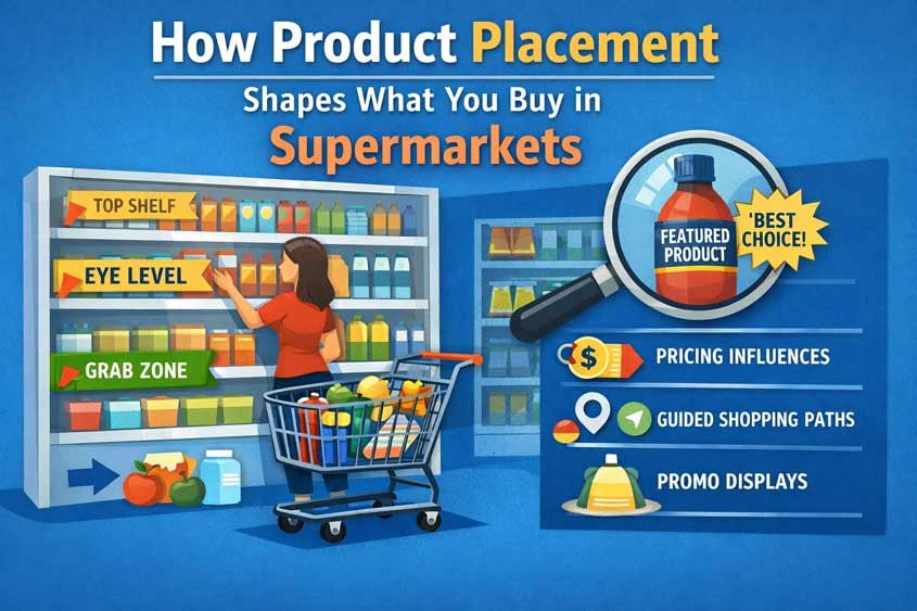
Eye Level Is Buy Level
There’s a quiet rule inside retail that almost no shopper thinks about, yet it shapes a huge share of what ends up in your basket: eye level is buy level.
Stand in front of any supermarket shelf and just pause for a second. Don’t reach. Just look. Where do your eyes land first? Not at the top. Not at the bottom. Right in the middle. That narrow band, usually between chest and eye height, is the most valuable real estate in the entire store.
And it performs. Consistently.
Retail studies have shown that products placed at eye level can outsell those on lower or higher shelves by a significant margin. The exact percentage varies by category, but the direction never changes. Visibility drives attention. Attention drives choice. You don’t buy what you don’t see, and you rarely go digging unless you have a strong reason.
This is where product placement in supermarkets stops being subtle and starts being strategic.
That middle shelf is not earned by chance. It’s bought.
Manufacturers pay retailers for that positioning. These payments are often called slotting fees or placement fees. Big brands invest heavily to secure eye-level space because they know the return is predictable. If your product sits where the majority of shoppers naturally look, your chances of being chosen increase without needing to compete as hard on price or messaging.
Now flip that perspective.
If a product is on the bottom shelf, it’s not necessarily worse. In fact, it’s often cheaper. Store brands and budget options are frequently placed lower, not because they lack value, but because they lack the same marketing budget to compete for premium placement.
So when you instinctively grab what’s in front of you, you’re not just making a preference decision. You’re responding to a visibility advantage that someone paid for.
There’s also a mental shortcut happening here. When something sits at eye level, it feels… safer. More standard. Your brain reads it as the default option. You don’t question it as much. It reduces friction. And in a shopping environment filled with small decisions, reduced friction usually wins.
This ties directly into another trigger you’ve probably felt: cognitive ease. The easier something is to process, the more likely you are to accept it. Eye-level placement makes products easier to see, easier to compare, and easier to grab. That combination is powerful.
And it’s not just about single products. Brands often try to dominate the entire eye-level zone. If you see the same brand repeated across that middle shelf, it creates a sense of familiarity and authority. It starts to feel like the “main” choice in that category, even if alternatives exist just a little above or below.
You see this everywhere. Breakfast cereals. Snacks. Sauces. Even cleaning products. The pattern repeats because it works.
Here’s a simple way to test it next time you shop. Pick a category you usually buy without thinking, like pasta or yogurt. Instead of grabbing what’s in front of you, look one shelf up and one shelf down. You’ll often find different brands, different prices, sometimes even better deals. But you had to break your natural scanning pattern to notice them.
That’s the key idea. Product placement in supermarkets doesn’t force you to buy anything. It just makes certain choices easier than others. And most of the time, easier is enough.
Children’s Eye Level Placement
Now shift your focus a bit lower. Not where you naturally look, but where a child looks.
That’s a completely different battlefield.
In the context of product placement in supermarkets, children’s eye level is one of the most deliberate and calculated zones in the store. It’s not just about visibility anymore. It’s about influence. Specifically, influence over someone who isn’t paying… but strongly affects the person who is.
Walk down a cereal aisle and you’ll see it immediately. The lower shelves are packed with bright colors, cartoon characters, playful fonts, and bold promises. Chocolate flavors. Marshmallows. Shapes instead of flakes. It feels almost like a different category compared to the more “serious” options sitting higher up.
That’s not accidental placement. That’s targeting.
Children don’t scan shelves the way adults do. They don’t compare nutritional labels or price per unit. They react to what stands out, what feels fun, what they recognize. So brands design products that grab attention instantly, then place them exactly where that attention naturally goes.
Right at their eye level.
Now layer in behavior.
A child spots something appealing. They point. They ask. Sometimes they insist. And suddenly, the decision is no longer just about product preference. It becomes a social interaction between you and them, right there in the aisle.
This is where what marketers call “pester power” comes into play. It’s not a technical term you’ll see on packaging, but it’s very real in practice. Children influence buying decisions by repeatedly asking for specific products, and supermarkets are structured to encourage those moments.
Think about how often this scenario plays out. A parent enters the store with a clear plan. Get essentials. Stay focused. Then somewhere along the way, a child locks onto a product placed perfectly at their height. The request comes. Maybe it’s resisted at first. Maybe not. But the friction has been introduced.
And friction changes outcomes.
From a psychological standpoint, this taps into emotional decision-making. Saying no repeatedly takes effort. It creates tension. In a busy shopping trip, with time pressure and a full list to get through, many parents choose the easier path. They say yes, just to keep things moving.
So the placement doesn’t need to convince the parent directly. It works through the child.
That’s what makes this layer of product placement in supermarkets so effective. It bypasses traditional evaluation. It creates a moment instead. A small negotiation. And in many cases, that’s enough to shift what ends up in the cart.
You’ll notice this strategy extends beyond cereals. Snacks, candies, small toys, even certain drinks follow the same pattern. Lower shelves become a curated space of high-appeal, high-margin products designed for quick emotional reactions.
And there’s another subtle detail. These products are often individually packaged or positioned as small treats. That lowers the perceived cost of saying yes. It feels like a minor decision, not a major one. “It’s just one item” becomes the justification.
But those small decisions add up. Over time, they shape buying habits, brand preferences, and even expectations during future shopping trips.
Next time you’re in a supermarket, take a second to observe this dynamic instead of participating in it automatically. Watch where children look. Watch what they reach for. Then glance at where those products are placed.
Once you see it, it’s hard to ignore.
End of Aisle Displays (End Caps)
If eye level is prime real estate, then end caps are billboards.
You know exactly what I’m talking about. Those displays sitting at the end of each aisle, impossible to miss, often stacked high with products and bold price signs. You don’t even have to enter the aisle to see them. They interrupt your path. They demand a glance.
In product placement in supermarkets, end caps are built for one thing: visibility at scale.
Think about how you move through a store. You walk along the main aisles, turning your head slightly as you pass each intersection. That’s where end caps sit. Right in your natural line of sight, before you’ve committed to turning into any specific aisle. They catch you early, before your attention gets diluted by dozens of competing products.
And that timing matters.
Because at that moment, you’re still open. You haven’t started comparing brands. You haven’t narrowed your focus. You’re just moving. And something placed right there can shift your attention instantly.
Retailers and manufacturers know this. That’s why end caps are rarely given away casually. Just like eye-level shelves, these spots are often negotiated and paid for. Brands compete to appear there, especially during key sales periods or product launches.
Now here’s where it gets interesting.
End caps are almost always associated with deals. Big numbers. Bright colors. Words like “offer,” “special,” or “limited.” Your brain has learned to interpret these signals as savings, even before you check the actual price.
But here’s the catch. They’re not always the cheapest option in the store.
Sometimes the same product is available inside the aisle at a lower unit price. Sometimes a competing brand offers better value but sits quietly on a regular shelf. The end cap doesn’t guarantee the best deal. It guarantees attention.
And attention often overrides careful comparison.
This is a classic example of perceived value versus actual value. The placement, the signage, the volume of products stacked together, all combine to create a sense of urgency and opportunity. It feels like you’re getting something special, something worth grabbing now.
Add a bit of scarcity language or time pressure, and the effect gets stronger. Even if the promotion is ongoing, it still feels temporary in that moment.
There’s also a social proof element hiding here. When you see a large display, fully stocked or slightly depleted, your brain reads it as popular. “This must be selling.” That perception alone can push you closer to buying, especially if you’re unsure.
And let’s not ignore convenience.
End caps remove friction. You don’t have to search. You don’t have to compare across a full shelf. The decision is simplified. One product. One price. Right in front of you. In a busy shopping trip, that simplicity is powerful.
You see this tactic everywhere, not just in food. Think about seasonal items, cleaning supplies, drinks, even non-grocery categories like small electronics or personal care. The pattern holds because the behavior behind it is consistent.
So when you walk past an end cap and feel that small pull to stop and look, that’s not random. That’s product placement in supermarkets doing exactly what it’s designed to do. Interrupt, simplify, and convert.
Next time, take an extra second. Look at the price. Compare it mentally with what you usually pay. Sometimes it’s a genuine deal. Sometimes it just looks like one.
Cross Merchandising
Now here’s a tactic that feels helpful on the surface. Almost like the store is doing you a favor.
You go in for pasta, and right next to it, there’s sauce. Maybe grated cheese. Maybe even a small display of wine a few steps away. Everything you need, grouped together, no extra searching. Convenient, right?
That’s cross merchandising. And inside product placement in supermarkets, it’s one of the most effective ways to quietly increase how much you buy.
The idea is simple. Place related products next to each other so you don’t have to think too much. But the impact runs deeper than convenience.
Because every time you avoid thinking, you’re more likely to keep adding.
Let’s break that down.
Normally, your shopping list acts as a boundary. You came in for specific items. Pasta might be on that list. Sauce might not be. Without a prompt, you might not even consider it in that moment. You’d remember later. Or you’d use something you already have at home.
But when the sauce is right there, within arm’s reach, the situation changes. The decision becomes immediate. Effortless. Almost automatic.
“Yeah, I’ll grab one.”
That small addition is the win.
This taps directly into cognitive ease again. Your brain prefers paths that require less effort. Searching different aisles, recalling what you need, comparing options, that takes energy. Cross merchandising removes those steps. It compresses multiple decisions into one simple moment.
And once you say yes once, it gets easier to say yes again.
You’ll see this pattern everywhere if you start paying attention. Chips next to salsa. Crackers next to cheese spreads. Coffee near biscuits. Meat sections paired with marinades or spices. Even non-food examples show up. Think shaving razors placed with shaving cream, or batteries next to electronic devices.
It’s all built around the same principle. Trigger a chain reaction.
In many cases, these combinations are not random. They’re based on data. Retailers analyze which products are frequently bought together, then physically recreate that relationship in the store layout. What used to happen in your mind now happens in front of your eyes.
And that shift matters.
Because when the suggestion is external, you’re less likely to question it. It feels logical. Even helpful. You’re not being “sold to.” You’re just being reminded.
But that reminder has a cost.
Another layer to this is basket anchoring. Once you start adding complementary items, your perception of what a “normal” purchase looks like begins to expand. A simple meal turns into a fuller setup. Pasta becomes pasta, sauce, cheese, maybe a dessert. The baseline grows without you explicitly deciding to increase it.
That’s how average basket size increases over time.
There’s also a subtle emotional component. Buying related items together creates a sense of completeness. It feels like you’re planning better, preparing properly, doing things right. That feeling reinforces the behavior, making you more likely to repeat it on future trips.
So while cross merchandising looks like organization, it’s really a form of guidance. A quiet nudge that says, “If you’re buying this, you probably need that too.”
And most of the time, you go along with it.
That’s the strength of product placement in supermarkets at this level. It doesn’t push. It suggests. And those suggestions, placed at the right moment, are often enough.
Staples Placed at the Back
Here’s one of the most consistent patterns you’ll see in any store, once you start paying attention.
Milk is rarely near the entrance. Eggs aren’t either. Bread might be closer sometimes, but often still not right at the front. The things you came in for, the basics, the staples, are almost always placed deep inside the store.
That’s not poor organization. That’s strategy.
In product placement in supermarkets, staples are used as anchors. Retailers know you will come for them. You don’t need to be convinced to buy milk. The demand is already there. So instead of making it easy, they make it… slightly inconvenient.
You have to walk.
And that walk is where everything happens.
From the entrance to the back of the store, you pass dozens of categories. Fresh produce, bakery items, snacks, drinks, promotions, seasonal displays. Each section is another opportunity to catch your attention, trigger a thought, or spark an impulse.
If milk were placed right at the front, most of that exposure would disappear. You’d grab what you need and leave. Fast. Efficient. Predictable.
But that’s not the goal.
The goal is to increase the number of decisions you make inside the store. Because every additional decision is a chance for an extra item to enter your basket.
Think about your own behavior. You walk in with a short list. Milk, eggs, maybe bread. But as you move through the store, something pulls your attention. A discounted snack. A new product. A familiar brand you haven’t bought in a while. You didn’t plan for it, but it feels reasonable in the moment.
So you add it.
And then maybe another.
By the time you reach the back and grab the item you originally came for, your basket already looks different than you expected.
That’s the path effect in action.
The longer and more engaging the path, the higher the chance of unplanned purchases. Retailers design store layouts to maximize this exposure without making it feel forced. The aisles flow in a way that feels natural, but they’re carefully structured to guide you past high-margin and high-interest products first.
There’s also a layering of psychological triggers happening along the way. End caps interrupt your movement. Cross merchandising suggests additions. Eye-level placement simplifies choices. It all stacks together, step by step, as you move deeper into the store.
By the time you reach the staples, you’ve already been influenced multiple times.
And here’s the subtle part. Because you eventually find what you came for, the experience still feels successful. You got your milk. Your eggs. Your bread. The extra items don’t feel like a failure. They feel like bonuses, small wins, maybe even smart choices.
That perception matters.
It keeps the system invisible.
Another detail worth noticing is that staple sections are often placed along the back wall or corners. This creates longer routes and encourages you to cover more ground. In larger stores, even the layout within the back section is designed to slow you down slightly, increasing the time you spend near other products.
Time in store correlates with spending. Not perfectly, but strongly enough to shape these decisions.
So the next time you walk into a supermarket for “just one thing,” pay attention to where that thing is located. Notice the path you take. Notice what you pass, what you glance at, what you almost grab.
That journey is not random.
It’s one of the clearest examples of how product placement in supermarkets turns movement into money.
Now You See It… And You Can’t Unsee It
By now, you’ve probably started to see supermarkets a bit differently.
What used to feel like a simple, practical errand is actually a carefully engineered experience. And at the center of it sits product placement in supermarkets, quietly shaping what you notice, what you consider, and what you end up buying.
Nothing we covered works in isolation.
Eye-level placement pulls your attention toward specific brands. Lower shelves speak directly to children, turning them into active participants in the decision. End caps interrupt your path and create the feeling of a deal, whether it truly exists or not. Cross merchandising removes the need to think, nudging you to add “just one more” item. And the placement of staples at the back ensures you’re exposed to all of this before you even reach what you came for.
Layer these together, and something interesting happens.
Your shopping trip stops being a series of independent decisions and becomes a guided sequence. One small nudge leads to another. One easy choice makes the next one even easier. Before you realize it, your basket reflects not just your needs, but the environment you moved through.
And here’s the key point. None of these forces you to buy.
That’s what makes it effective.
You still feel in control. You can justify every item. You can explain each choice. But the conditions under which those choices were made? Those were carefully arranged in advance.
So what do you actually do with this?
Start by slowing down just a little. Not dramatically. Just enough to notice patterns. Look above and below eye level. Pause at end caps and check if the “deal” holds up. When products are grouped together, ask yourself if you really need the full set or if it just feels convenient in the moment.
And maybe most important, be aware of your path. If you came in for a few essentials, recognize that the store is designed to stretch that journey. The longer you wander, the more decisions you make. The more decisions you make, the more likely you are to add.
That awareness alone changes behavior.
You don’t have to resist everything. That’s not realistic. But once you understand how product placement in supermarkets works, you stop reacting automatically. You start choosing more deliberately.
And that shift, small as it seems, is where the real advantage is.

Gabriel Comanoiu is a digital marketing expert who has run his own agency since 2016. He learned marketing by testing, analyzing, and refining campaigns across multiple channels. In his book series Impulse Buying Psychology, he shares the psychological triggers behind every purchase, showing how to create marketing that connects, persuades, and converts.