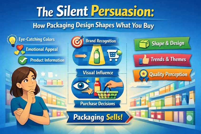
The Silent Persuasion
You don’t walk into a supermarket thinking about packaging design psychology. You just reach, grab, compare, and move on. It feels quick. Automatic. Almost… obvious.
But pause for a second. Why did you pick that specific cereal box? That exact bottle of juice? Why did one product feel “better” before you even checked the label?
That moment, right there, is where packaging design psychology quietly does its job.
Most buying decisions don’t start with logic. They start with a feeling. Your brain scans shelves crowded with options and looks for shortcuts. It doesn’t have time to analyze everything, so it leans on visual cues. Color, shape, size, texture, transparency. These aren’t just design choices. They are signals. And your brain is wired to interpret them fast.
Marketers know this. Actually, they rely on it.
Packaging becomes a kind of silent salesperson. It doesn’t speak, but it suggests. It nudges. It frames expectations before you even touch the product. A matte black box can whisper “premium.” A bright yellow label can shout “fun” or “tasty.” A clean, minimal design can imply “healthy” or “pure,” even if the ingredient list tells a different story.
And here’s the tricky part. You don’t experience these signals as manipulation. You experience them as a preference.
You think you chose the product because it looked better. Because it felt right. Because it matched what you wanted in that moment. And sure, that’s partly true. But that “feels right” reaction is often engineered.
There’s a whole ecosystem of psychological triggers working together here. Familiarity makes you trust what you’ve seen before. Social proof labels like “best seller” reduce hesitation. Pricing tricks shape how you perceive value. And right in the middle of all that sits packaging, tying everything together visually.
It sets the tone before price even enters the conversation.
Think about it. Two identical products. Same quality, same ingredients, same price. Change only the packaging. One looks cheap, cluttered, slightly off. The other looks clean, intentional, well-designed. You already know which one most people will pick.
And it’s not because they compared features.
It’s because design changed perception.
In this article, you’ll start seeing packaging differently. Not as decoration, but as strategy. You’ll notice how color influences appetite and trust. How transparency builds confidence. How size illusions quietly push you to buy more than you planned.
Once you see it, you can’t really unsee it.
And more importantly, you’ll understand exactly how it’s shaping your decisions every single time you shop.
Table of Contents
Color psychology
Walk into any supermarket and try this. Don’t read labels. Don’t check prices. Just look at the colors.
You’ll start noticing patterns almost immediately. Entire categories share similar palettes. Snacks lean loud and warm. Health foods lean calm and earthy. Premium products go darker, quieter, more restrained.
That’s not coincidence. That’s packaging design psychology doing exactly what it’s supposed to do. Guide your attention, shape your expectations, and influence your decision before logic gets involved.
Your brain processes color faster than text. In milliseconds, it forms an impression. Safe or risky. Tasty or bland. Cheap or premium. Worth it or not. You’re not thinking through these judgments. You’re feeling them. And once that feeling is there, everything else tends to follow it.
Let’s break down the two most powerful color directions you’ll see again and again.
Red and yellow are everywhere in food. There’s a reason for that.
These colors stimulate appetite. That’s not a vague marketing claim. It ties back to how your brain responds to visual intensity and warmth. Red increases arousal. It grabs attention fast. It signals urgency, energy, even a bit of excitement. Yellow adds brightness. It feels cheerful, approachable, easy.
Put them together and you get a combination that’s hard to ignore.
Think about fast snacks. Chips, sugary cereals, ready meals. They often lean heavily on reds, yellows, and oranges. You don’t need to read “delicious” or “tasty.” The color already told you.
And there’s something else happening here. These colors reduce hesitation.
Warm, bright tones create a sense of immediacy. You feel a subtle push to act now instead of later. It connects with other psychological triggers like scarcity and impulse buying. Even if there’s no real urgency, the visual language suggests there might be. Your brain doesn’t always stop to question it.
Ever noticed how discounted items or promotional tags often use red? That’s not random. Red signals importance. It says “look here” without using words. Combine that with a price drop and you get a powerful mix of attention and perceived value.
Now contrast that with green.
Green plays a completely different game.
Where red and yellow push, green reassures.
Green signals health, freshness, and natural ingredients. It taps into your associations with plants, nature, and balance. Even if a product is processed, adding green tones can shift how you perceive it. It feels lighter. Cleaner. Better for you.
And here’s where packaging design psychology gets a bit sneaky.
The presence of green doesn’t always reflect reality. A snack can still be high in sugar or calories, but if the packaging uses soft greens, leafy visuals, and minimal design, your brain softens its judgment. You’re more likely to categorize it as a “better choice.”
This ties directly into what’s sometimes called the health halo effect. One positive cue creates a broader assumption. You see green, you think healthy. Once that label is in your head, you’re less critical about the details.
You’ll see this a lot in organic sections or premium ranges. Muted greens, beige tones, off whites. Nothing too loud. Nothing too aggressive. The goal isn’t to excite you. It’s to earn your trust.
And trust is powerful.
When you trust a product, you spend less time evaluating it. Decision friction drops. You move faster. You’re also more willing to pay a higher price because the perceived quality feels higher. That’s anchoring at work, shaped visually before you even see the number.
There’s also an interesting contrast strategy happening across shelves.
Imagine a row of brightly colored snack packages. Reds, yellows, bold fonts, loud claims. Now place a simple green package right in the middle. Minimal text. Clean layout. It stands out not by being louder, but by being calmer.
Your eye goes there.
That’s deliberate. Designers know that contrast isn’t just about brightness. It’s about difference. And sometimes the quietest design wins attention because everything else is shouting.
Color also helps with positioning across price tiers.
Lower cost products often use brighter, more saturated colors. They compete for attention. They need to be seen quickly. Premium products, on the other hand, tend to dial things down. Dark greens, deep blacks, subtle gold accents. The message shifts from “look at me” to “you already know this is good.”
That shift changes how you behave.
You slow down. You take it more seriously. You justify a higher price because the design suggests higher value. Even if you don’t consciously think that, your brain is adjusting your expectations in the background.
And then there’s consistency.
Brands don’t choose colors once. They build entire identities around them. Over time, repeated exposure creates familiarity. You start recognizing products from a distance. That familiarity reduces uncertainty. It’s the same mechanism behind the mere exposure effect. The more you see something, the more you tend to like and trust it.
So when you reach for a product because it “feels familiar,” color is often a big part of that feeling.
Here’s a simple way to test all of this next time you shop.
Pick a category. Yogurt, snacks, drinks. Scan the shelf and group products by color before you even read them. You’ll notice clusters. Indulgent options grouped in warm tones. Healthy options in greens and whites. Premium options in darker, minimal designs.
Once you see the pattern, it’s hard to ignore.
And that’s the point. Packaging design psychology doesn’t try to trick you in obvious ways. It works because it aligns with how your brain already processes information. Fast, emotional, pattern based.
Color just happens to be one of the most efficient tools to guide that process.
Transparent packaging
There’s a moment that happens almost instantly when you pick up a product with transparent packaging.
You don’t read anything. You don’t analyze. You just look through it.
And somehow, that feels… reassuring.
That reaction is exactly why transparent packaging shows up so often in categories where trust matters. Fresh foods, snacks, supplements, even cosmetics. When you can see the product, your brain relaxes. It feels like there’s nothing to hide.
That’s the core of this piece of packaging design psychology. Visibility reduces uncertainty.
When a product is fully enclosed in opaque packaging, you rely entirely on what the brand tells you. Images, claims, promises. You’re taking a small leap of faith. But when the packaging lets you see inside, that leap gets smaller.
You verify things yourself.
Are the strawberries fresh? Are the nuts whole? Does the granola actually look like the picture? You answer those questions in seconds, without effort. That direct confirmation builds trust faster than any slogan ever could.
And here’s the important part. It’s not just about what you see. It’s about what you feel when you see it.
Transparency creates a sense of honesty.
Even if you don’t consciously think “this brand is more honest,” your brain registers the openness. It lowers your guard. That’s a big deal in a shopping environment where skepticism is always present, even if it sits quietly in the background.
This ties closely to another psychological trigger. Risk reduction.
Every purchase carries a small risk. Will it taste good? Will it be fresh? Will it match expectations? Transparent packaging reduces that perceived risk because it gives you evidence. Not claims. Evidence.
And when risk goes down, buying becomes easier.
You hesitate less. You decide faster. You’re more comfortable picking a product you haven’t tried before because you feel like you already know what you’re getting.
Now, here’s where it gets interesting.
Transparent packaging doesn’t just show reality. It frames it.
Brands don’t randomly decide what to reveal. They choose specific windows, shapes, and angles that highlight the best parts of the product. A small clear section can be enough to suggest quality, even if the rest remains hidden.
Think about a bag of trail mix with a transparent strip down the middle. You see whole almonds, bright dried fruit, clean textures. That snapshot becomes your reference point for the entire product. You assume consistency, even though you’ve only seen a portion.
That’s a subtle but powerful shortcut your brain takes.
It connects to something called the representativeness heuristic. You judge the whole based on a small sample. If what you see looks good, you assume the rest is just as good.
And most of the time, you don’t question it.
There’s also a strong link between transparency and perceived freshness.
In categories like bakery items or produce, visibility signals immediacy. It feels less processed, less industrial. Even if the product went through the same supply chain as others, the ability to see it creates a sense of closeness. Like it’s more real, more tangible.
Compare a fully sealed, printed box of cookies with a simple plastic container where you can see the cookies stacked inside. Same product, potentially identical quality. But the transparent version often feels fresher.
That feeling matters.
Freshness is one of the strongest drivers of food choice. When packaging reinforces it visually, it reduces the need for further evaluation. You don’t need to check dates as carefully. You don’t need to read as much. The decision feels obvious.
And then there’s perceived quality.
Seeing the product allows you to judge details that packaging alone can’t fully communicate. Texture, color variation, size consistency. These cues help you form a quick quality assessment.
Are the nuts uniform or broken? Is the chocolate smooth or dull? Are the pieces generous or small?
You’re scanning all of this in seconds.
If the product looks high quality, you assign it a higher value. That directly affects how much you’re willing to pay. This connects back to price anchoring. The visual impression sets a reference point before you even look at the price tag.
And once that anchor is set, the price often feels more acceptable.
But transparency isn’t always the right choice. And that’s where the strategy becomes even clearer.
Brands avoid transparent packaging when the product doesn’t benefit from scrutiny. If visual inspection might raise doubts, they control the narrative instead through design, imagery, and messaging.
So when you do see transparency, it’s usually intentional. It means the brand is confident that what’s inside will help sell the product.
Or at least, that the part you can see will.
There’s also a hybrid approach you’ll notice more and more. Partial transparency combined with strong design elements. A clear window surrounded by carefully chosen colors, typography, and claims.
This blends two psychological advantages.
You get the trust from visibility and the positioning from design. A green and earthy package with a transparent window doesn’t just show the product. It tells you it’s natural, clean, and worth trusting. The cues reinforce each other.
And reinforcement is key in packaging design psychology.
Rarely does one element work alone. Color, transparency, size, typography. They all layer together, creating a consistent message that feels intuitive. You don’t pick it apart. You just go with what feels right.
That’s the whole system working as intended.
Next time you’re in a store, pay attention to how quickly you gravitate toward products you can see. Notice how your hand moves before your mind catches up. It’s a small shift, but once you see it, it’s hard to ignore.
Because in that moment, you’re not just choosing based on need.
You’re responding to visibility, trust, and the quiet suggestion that what you see is exactly what you’ll get.
Larger packaging illusion
Pick up a product that looks big. Feels big. Takes up space in your hand or your cart.
Now check the actual quantity.
That small moment of surprise you sometimes get? That’s not an accident. That’s packaging design psychology working through size perception.
Because here’s the thing. You don’t evaluate quantity with numbers first. You evaluate it visually.
Your brain uses physical size as a shortcut for value. Bigger package equals more product. More product equals better deal. It feels obvious. Almost too obvious to question.
And that’s exactly why it works.
Brands design packaging to stretch that perception. Not by lying about the quantity, but by shaping how you interpret it. Subtle changes in dimensions, proportions, and structure can make a product look significantly larger than it actually is.
Height is one of the most common tricks.
Taller packages feel more substantial than shorter, wider ones, even when they contain the same volume. Your eye reads vertical space as “more.” So a slim, tall cereal box can feel like better value than a compact one, even if the weight printed on the side says otherwise.
Most people don’t rotate the box and compare grams per package. They go with the first impression.
Then there’s air.
Empty space inside packaging, often called slack fill, plays a big role. A bag of chips looks full. It has volume. It occupies space in your cart. But a portion of that space is air.
Technically, some air is necessary for protection and shelf life. That part is true. But the amount can also be optimized to enhance perceived size. A slightly larger bag with the same product inside feels like more, even if it isn’t.
Your brain doesn’t measure density. It reacts to volume.
This connects directly to perceived value.
When something looks bigger, you expect to pay more for it. So when the price appears “reasonable” relative to that size, it feels like a good deal. Even if, on a per unit basis, it’s not.
That’s where unit pricing confusion quietly steps in. Price per kilogram or liter sits there on the shelf label, but most people don’t rely on it. It requires effort. Comparison. A bit of math.
Visual size is instant.
And in a fast moving shopping environment, instant usually wins.
There’s also shape manipulation.
Packages can be designed with wider fronts, curved edges, or expanded bases that increase shelf presence without significantly increasing volume. From the front view, which is how you usually see products on a shelf, they look larger and more dominant.
That dominance matters.
Your attention naturally goes to bigger objects first. It’s a basic visual bias. Larger items feel more important, more relevant. So they get noticed earlier, picked up more often, and considered more seriously.
That initial attention advantage can be enough to win the sale.
And once you pick up a product, another psychological shift happens.
You start justifying the choice.
Holding a large package creates a subtle sense of abundance. It feels like you’re getting more. That feeling reduces the pain of paying. Spending a bit more doesn’t feel as bad when the product seems generous.
This ties into loss aversion in an interesting way. If a slightly larger package costs only a bit more, you might feel like you’re missing out by choosing the smaller one. The bigger option becomes the safer choice, even if you don’t actually need the extra quantity.
So you upgrade.
Not because you calculated the value, but because the design nudged you.
There’s also a contrast effect happening on shelves.
Place a large looking package next to smaller ones and it becomes the reference point. Everything else looks less valuable by comparison. Even if those smaller packages offer better unit pricing, they feel like a compromise.
That’s intentional.
Retail environments are designed to guide comparisons in specific ways. Packaging size becomes part of that system. It frames your perception before you even consider the details.
And then there’s the role of portion perception.
Larger packaging doesn’t just influence what you buy. It can influence how much you consume later. When a product comes in a bigger container, you tend to serve yourself more. It resets what feels like a normal portion.
So the impact continues beyond the purchase.
Now, it’s worth noting something important. None of this requires deception. The actual quantity is always there, printed clearly. The information is available.
But packaging design psychology doesn’t compete on information. It competes on attention and perception.
And perception usually comes first.
You could stand in the aisle, compare unit prices, calculate value per gram, and make a purely rational decision. That option exists. But in reality, most decisions happen faster than that.
You rely on visual cues because they’re efficient.
Brands understand this. They design for it.
That’s why you’ll often see a combination of tactics working together. A tall package with warm, appetite stimulating colors. A transparent window showing just enough of the product. A label suggesting value or quality.
Each element reinforces the others.
By the time you read the quantity, your decision is already leaning in one direction.
And sometimes, it’s already made.
Next time you shop, try a simple experiment. Ignore the front of the package for a moment. Flip it. Look at the net weight or volume first. Then compare it with how big the product looked from the front.
The gap between those two impressions is where the illusion lives.
And once you notice it, you start seeing it everywhere.
You Didn’t Choose the Product. The Packaging Chose You
By the time you reach for a product, a lot has already happened.
Not consciously. Not deliberately. But your brain has scanned colors, shapes, transparency cues, and size signals. It has formed an impression, assigned value, reduced uncertainty, and nudged you toward a decision that feels like your own.
That’s packaging design psychology in action.
It doesn’t force you. It guides you.
Color set the tone. Warm shades pushed appetite and urgency. Greens softened your judgment and suggested health, whether fully deserved or not. Transparent packaging lowered your guard by showing just enough to build trust. Larger packaging stretched your perception of value, making certain options feel like better deals before you even looked at the numbers.
None of these tactics work in isolation.
They layer together, often reinforced by other triggers you’ve seen across the store. Familiarity makes certain designs feel safe. Anchoring shapes how you interpret price once you see it. Social proof labels reduce hesitation. Even store layout quietly directs your attention toward the products most likely to convert.
Packaging sits right at the center of all this. It’s the first handshake between you and the product.
And it happens fast.
You don’t stand there analyzing design choices. You react. You feel. You move on. That speed is what makes these tactics so effective. They slip under the radar, shaping decisions without demanding your attention.
But once you start noticing them, something shifts.
You pause a bit more. You question why a product feels premium or healthy or worth the price. You look beyond the surface cues and check what’s actually there. Quantity. Ingredients. Real value.
You don’t stop being influenced. That’s not realistic.
But you become harder to nudge without noticing.
And that changes how you shop.
Because at the end of the day, packaging design psychology isn’t just about selling more products. It’s about shaping perception at scale. It influences millions of small decisions, repeated daily, across every category you can think of.
Food, cosmetics, supplements, household goods. The principles stay the same. Only the execution changes.
So the next time something “just feels right” on the shelf, take a second.
Look at the color. The size. What you can see and what you can’t.
Chances are, that feeling didn’t come from nowhere.
It was designed.

Gabriel Comanoiu is a digital marketing expert who has run his own agency since 2016. He learned marketing by testing, analyzing, and refining campaigns across multiple channels. In his book series Impulse Buying Psychology, he shares the psychological triggers behind every purchase, showing how to create marketing that connects, persuades, and converts.