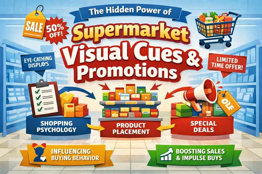
Why Your Eyes Decide Before You Do
You walk into a supermarket thinking you’re in control. You have a list. Maybe even a budget. You tell yourself this will be quick. In and out.
Then something small happens.
A bright red tag catches your eye. A bold “LIMITED TIME” sign sits slightly off center, almost like it’s leaning toward you. A stack of products appears right where your path naturally slows down. You didn’t plan to stop, but you do. Just for a second.
That second is the whole game.
Supermarket visual cues are designed for that exact moment. Not to force you, not to pressure you outright, but to quietly guide your attention before your rational brain fully shows up. And attention is everything. You don’t buy what you don’t notice.
Your brain processes visual information in milliseconds. Faster than you read, faster than you think. Colors, shapes, contrast, placement, all of it gets filtered instantly. Red signals urgency. Yellow suggests value. Big fonts feel important. Even spacing matters. A product surrounded by empty space looks more premium. A crowded shelf feels like competition or popularity, depending on how it’s framed.
None of this is accidental.
Retailers lean heavily on what’s called pre-attentive processing. That’s the stage where your brain reacts before conscious thought kicks in. It’s the same reason you instinctively notice movement in your peripheral vision or why a flashing sign pulls you in without permission. Supermarket visual cues live in that space. They don’t argue with you. They bypass you.
And once your attention is captured, other psychological triggers start stacking. Anchoring kicks in when you see a “discounted” price next to a higher one. Scarcity messaging makes you feel like waiting is a risk. Even social proof sneaks in when shelves look slightly depleted, suggesting others got there first.
It’s subtle, but it adds up fast.
You might think you’re making a series of independent choices. In reality, you’re moving through a carefully staged environment where each visual signal nudges you, just a little, in a specific direction. Not enough to feel manipulated. Just enough to feel like your idea.
That’s the craft behind supermarket visual cues. They don’t need your full attention. They just need your eyes for a moment.
Table of Contents
Bright Labels (Red, Yellow Tags)
You know those bright red and yellow tags that seem to shout at you from the shelf? They work. Almost embarrassingly well.
Supermarket visual cues rely heavily on color because your brain assigns meaning to it instantly. Red doesn’t ask for permission. It signals urgency, importance, sometimes even danger. Yellow leans into attention and optimism. Put them together on a price tag and your brain reads one thing before you even look at the number: deal.
Here’s where it gets interesting. The size of the discount often doesn’t matter as much as the presence of the cue itself.
A product marked down from 10 to 9.50 suddenly feels like an opportunity. Objectively, you save 0.50. That’s small. But the red label reframes the situation. You’re no longer just buying a product, you’re “catching” a deal. That shift taps into a mix of loss aversion and reward anticipation. You don’t want to miss out on savings, even when the savings are barely there.
And your brain doesn’t pause to calculate.
Most shoppers don’t run percentage math in the aisle. They scan. They react. A red tag cuts through the noise faster than any number could. It acts like a shortcut, telling you where to look and what to prioritize. In a space full of options, that shortcut becomes incredibly powerful.
There’s also contrast at play. Regular price tags fade into the background because they’re expected. Neutral colors, small fonts, predictable placement. But a bright label breaks the pattern. Your brain is wired to notice what’s different. That’s a basic survival mechanism being repurposed to sell cereal.
Even the wording on these tags is carefully chosen. “Special offer.” “Today only.” “Save now.” None of these phrases give you full context. They don’t need to. They create just enough tension to push you closer to a decision. You fill in the gaps yourself.
And once you pick up the product, something subtle happens. The likelihood of buying it increases sharply. There’s a concept called the endowment effect. As soon as you hold something, it starts to feel like yours. That tiny action, triggered by a bright label, moves you one step closer to the checkout.
It’s not just supermarkets doing this. Walk into any electronics store and you’ll see red discount stickers next to TVs. Clothing retailers love bold sale signs during seasonal shifts. Online stores replicate the same effect with colored badges and strikethrough prices. Different industries, same psychological lever.
But supermarkets have an advantage. Volume and repetition.
You don’t see one red tag. You see dozens. Maybe hundreds. Over time, your brain starts associating those colors with smart shopping. You feel like you’re navigating the store efficiently, spotting deals others might miss. There’s a quiet sense of winning, even if the actual savings don’t justify it.
And that’s the point.
Supermarket visual cues like bright labels don’t need to lie. They just need to frame reality in a way that feels urgent and beneficial. The math can be minimal. The perception does the heavy lifting.
Next time you reach for a product because of a red tag, pause for a second. Not to resist it, just to notice it. That reaction you felt, that quick pull, that’s the system working exactly as designed.
Limited Time Messaging
“Today only.”
“Ends tonight.”
“Last chance.”
You’ve seen these everywhere. In supermarkets, online stores, even on food delivery apps at 2 a.m. They all tap into the same pressure point. Time.
Supermarket visual cues don’t just tell you what’s a deal. They tell you when that deal disappears. And that changes everything.
Because the moment a purchase feels temporary, your brain stops treating it like a simple choice and starts treating it like a potential loss.
That’s where fear of missing out kicks in. Not in a dramatic way. More like a quiet nudge in the background. If you don’t act now, you lose the opportunity. And humans are wired to avoid losses more strongly than they pursue gains. Losing 5 feels worse than gaining 5 feels good. So even a small, time-limited discount suddenly carries more weight than it should.
You weren’t planning to buy that snack. But now it’s “2 for 1, today only.”
You pause. You imagine coming back tomorrow and paying full price. That tiny imagined loss pushes you forward.
And here’s the thing. Most of these deadlines aren’t as strict as they sound.
Supermarkets often rotate promotions on predictable cycles. A “limited time” offer might return next week under a slightly different label. But you don’t know that in the moment. And more importantly, you don’t feel like taking the risk.
That uncertainty is intentional.
Supermarket visual cues use time pressure to shrink your decision window. When you feel like the clock is ticking, you spend less time comparing options, checking unit prices, or questioning whether you need the product at all. You default to quicker, more instinctive decisions.
It’s a subtle form of cognitive overload. Not because there’s too much information, but because there’s not enough time to process it comfortably.
And once that urgency is in place, other triggers layer on top.
Anchoring shows you the “original” price to make the current one feel like a win. Bright labels pull your attention so you don’t miss the offer. Even product placement plays a role. Limited time deals are often placed at eye level or along high traffic paths, where you’re more likely to encounter them without effort.
You’re not just seeing the message. You’re being guided into it.
This tactic isn’t limited to supermarkets. Airlines use countdown timers for ticket prices. E commerce sites flash “Only 3 left in stock.” Streaming services highlight content that’s “leaving soon.” Different contexts, same psychological mechanism. Time pressure reduces hesitation.
But supermarkets have a unique advantage. Frequency.
You’re exposed to these messages regularly. Weekly shopping trips. Repeated exposure builds familiarity, and familiarity lowers resistance. At some point, reacting to “limited time” stops feeling like a decision. It becomes a habit.
And habits are powerful. They run quietly in the background while you think you’re in control.
Next time you see a “today only” tag, slow down just a bit. Ask yourself a simple question. Would you still buy this if the offer existed tomorrow?
That tiny pause breaks the spell. Not completely. But enough to remind you that urgency is often manufactured.
Large Carts vs Small Baskets
Grab a cart instead of a basket and something subtle shifts. You probably don’t notice it happening, but your behavior starts to drift.
Supermarket visual cues aren’t just about what you see on shelves. They extend to the tools you use while shopping. And cart size is one of the most overlooked levers in the entire store.
A large cart changes your perception of quantity. Plain and simple.
Drop five items into a big cart and it looks empty. Almost unfinished. There’s no visual signal telling you that you’ve already picked up enough. Compare that to a small basket. The same five items suddenly feel like progress. Space fills up quickly. You get a natural stopping cue.
That difference matters more than it should.
Your brain relies heavily on visual feedback to judge how much you’ve done. When the cart still looks empty, it quietly suggests you haven’t done enough yet. So you keep going. One more item. Then another. Not because you need them, but because the space is still there.
It’s a kind of completion bias. You feel an urge to “round things out,” to make the cart look more appropriate for a full shopping trip. No one explicitly tells you to fill it, but the design nudges you in that direction.
And the bigger the cart, the stronger that effect becomes.
There’s also a reduced sense of spending. When items are spread out in a large cart, each one feels less significant. You lose the tight visual grouping that would normally remind you how much you’ve picked up. In a basket, everything is close together. You see the accumulation. In a cart, items get lost in the space.
Out of sight, slightly out of mind.
This ties directly into another psychological trigger: mental accounting. You’re not adding up your total in real time. You’re using visual cues as a proxy. And when those cues are diluted, your internal “budget alarm” stays quiet longer than it should.
Supermarkets know this.
That’s why carts have been getting bigger over time. There’s actual data behind this shift. When cart sizes increase, average spending tends to rise as well. Not because people suddenly need more groceries, but because their perception changes.
And it doesn’t stop there.
Notice how carts are almost always placed right at the entrance, easy to grab, slightly easier than baskets. Sometimes baskets are stacked off to the side or require a bit more effort to pick up. That small friction pushes you toward the cart before you’ve even started shopping.
Once you’re committed, your path is set.
Other industries use similar tactics. Fast food chains upsized meals by default. Streaming platforms auto play the next episode so you keep going. Gyms sell annual memberships because once you’re “in,” you’re more likely to stick around, at least mentally. The environment shapes the decision before you actively make it.
Back in the supermarket, the large cart works quietly alongside other supermarket visual cues. Bright labels draw your attention. Limited time messages speed up your decisions. And the cart? It absorbs everything without pushing back.
No resistance. No friction. Just space.
And space, it turns out, is an invitation.
Next time you walk in for a few items, try this. Skip the cart. Grab a basket instead. You’ll feel the difference within minutes. Your pace changes. Your awareness sharpens. And suddenly, every item has a bit more weight to it.
Funny how something as simple as size can reshape the entire shopping experience.
Signage Overload
At some point in your shopping trip, everything starts to blur.
“Discount.”
“New.”
“Family pack.”
“Best value.”
“Limited time.”
“Save now.”
Every shelf talks. Every aisle competes. Every product tries to be the one you notice.
This is where supermarket visual cues stop guiding and start overwhelming. And that’s not a mistake. It’s part of the design.
When you’re exposed to too many messages at once, your brain shifts gears. You stop analyzing and start simplifying. Psychologists call it decision fatigue. The more choices and signals you process, the harder it becomes to keep evaluating them carefully.
So you don’t.
You begin to look for shortcuts.
Maybe you grab the product with the brightest label because it feels like the safest bet. Maybe you default to a familiar brand just to avoid thinking. Maybe you pick the one placed at eye level because it’s right there and requires the least effort.
All of these are responses to overload.
Supermarket visual cues create a crowded environment on purpose. Not chaotic enough to frustrate you into leaving, but dense enough to push you toward faster decisions. There’s a fine line there, and retailers walk it carefully.
Here’s what’s happening under the surface.
Your brain has limited cognitive resources. Every price comparison, every label you read, every tiny decision chips away at that reserve. Early in your trip, you’re sharper. You might compare unit prices, check ingredients, question whether a promotion is actually worth it.
But as you move through the store, that effort adds up.
By the time you reach the middle or end of your shopping, you’re mentally tired. And when that happens, you lean heavily on external cues to decide for you.
That’s when promotions become especially powerful.
A red tag now feels less like a suggestion and more like a solution. It removes the need to evaluate. The decision is already framed. Same with “best seller” signs or “customer favorite” labels. They tap into social proof, giving you a quick justification to move on.
You’re not just buying a product. You’re buying relief from having to think.
There’s also something called the paradox of choice. When options increase, satisfaction doesn’t necessarily follow. In fact, too many choices can lead to hesitation, second guessing, or even avoidance. Supermarkets counter this by layering strong visual cues on top of that complexity.
They don’t reduce your options. They guide you through them.
Think about the cereal aisle. Dozens of brands, sizes, flavors. It should slow you down. But bright promotions, bold packaging, and shelf placement narrow your focus to a handful of “obvious” picks. The rest fade into the background.
That’s not clarity. That’s controlled attention.
Other industries use the same approach. Streaming platforms flood you with content but highlight a few “recommended” titles. Online stores show hundreds of products but tag some as “best choice” or “limited deal.” The overload creates the need for guidance, and the platform provides it.
Back in the supermarket, it all comes together.
Supermarket visual cues pull your attention, create urgency, and then, when you’re tired enough, they offer you an easy way out. A default. A shortcut. A decision that feels simple.
And most of the time, you take it.
If you notice yourself grabbing the first “good enough” option toward the end of your trip, that’s not random. That’s decision fatigue doing exactly what it’s supposed to do.
You Were Nudged Long Before You Chose
By the time you reach the checkout, it feels like you made a series of simple, independent choices. You picked what you needed. Maybe a few extras. Nothing unusual.
But if you rewind the experience, step by step, a different picture starts to form.
You noticed what the store wanted you to notice.
You felt urgency where the store created it.
You moved faster when time pressure showed up.
You bought more when space allowed it.
You simplified decisions when the environment became too dense.
That’s the quiet influence of supermarket visual cues. They don’t force decisions. They shape them early, subtly, and consistently.
Long before you compared prices or asked yourself “do I really need this,” your attention had already been directed. And attention is the first filter. It decides what even gets considered.
Once something passes that filter, the rest becomes easier to influence.
A red label reframes value.
A “limited time” sign compresses your thinking window.
A large cart lowers your sense of accumulation.
A crowded shelf pushes you toward shortcuts.
Individually, each of these feels small. Almost harmless. Together, they create a system that guides behavior without needing your full awareness.
And here’s the part most people miss.
These tactics don’t work because you’re careless. They work because your brain is efficient.
You’re constantly filtering information, reducing effort, making fast calls in environments that demand it. Supermarkets simply adapt to that reality. They design around your tendencies instead of fighting them.
That’s why resisting isn’t about willpower. It’s about awareness.
Once you recognize how supermarket visual cues operate, the experience changes. Not dramatically, not overnight, but enough. You pause a bit more. You question certain signals. You notice when urgency feels artificial or when a “deal” doesn’t actually change much.
You don’t need to analyze every purchase. That’s unrealistic. But even small adjustments shift the balance back in your favor.
Maybe you reach for a basket instead of a cart.
Maybe you ignore the first promotion and scan a bit wider.
Maybe you ask yourself one extra question before adding something to your cart.
Those moments add up.
Because the truth is, you were never just reacting to products. You were responding to a carefully designed environment built on supermarket visual cues.
And once you see it, you can’t really unsee it.

Gabriel Comanoiu is a digital marketing expert who has run his own agency since 2016. He learned marketing by testing, analyzing, and refining campaigns across multiple channels. In his book series Impulse Buying Psychology, he shares the psychological triggers behind every purchase, showing how to create marketing that connects, persuades, and converts.