When you make a decision, you probably feel like you’re calling the shots. You weigh the pros and cons, scroll a bit, compare a few offers, and boom, done. But the truth is a little messier. Your brain is constantly cutting corners, taking shortcuts, and leaning on patterns it already trusts. These shortcuts work fast, feel natural, and they save you effort. They also leave you open to subtle pushes from clever marketers who understand how your perception actually works in the real world.
This is where Cognitive and Perception Influences Triggers step in. These are the mental nudges that shape how you interpret information, evaluate choices, and decide what feels right. They don’t trick you; they guide you. Sometimes gently. Sometimes with a tiny shove you barely notice until you’re halfway through a checkout page wondering how that happened.
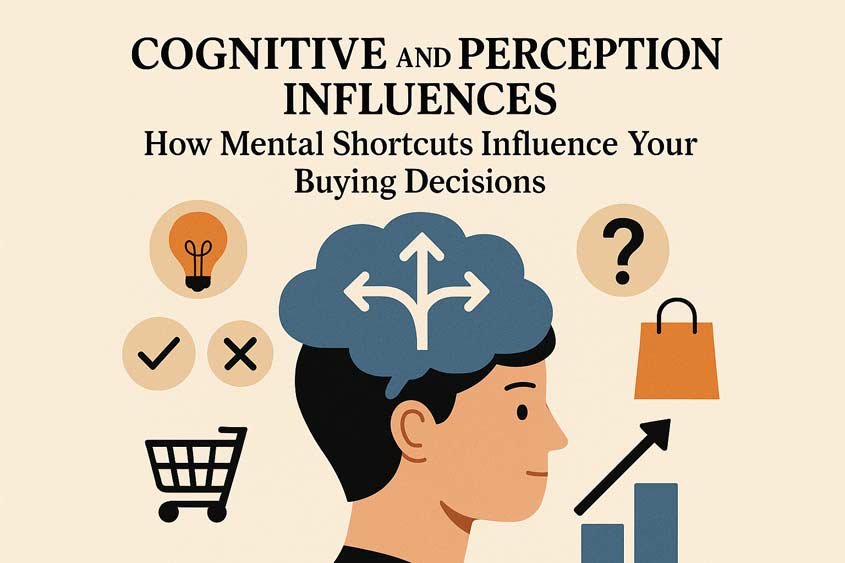
Table of Contents
In this category, you’ll run into several well-known triggers: Anchoring, Contrast Effect, Curiosity Gap, Novelty, Cognitive Ease, Priming, Decoy Effect, Paradox of Choice, Peak-End Rule, and Familiarity (Mere Exposure). You’ll see them everywhere once you know what to look for. A price comparison chart that makes the middle option feel sensible. A headline that leaves a small gap in your mind you can’t resist closing. A product that feels “new enough” to be exciting without making you work to understand it. A layout designed so smoothly your brain almost whispers, “Yeah, that’s right.”
What’s interesting is how normal all of this is. These triggers don’t show up only in ads. They show up when you pick a route home, choose a coffee, or skim a news feed. Marketers didn’t invent them. They just learned how to build around them.
Picture yourself browsing for a laptop. The first price you see—maybe 1,500 dollars—sticks in your mind, even if you don’t want it to. That’s anchoring at work. Or you try a new snack at the grocery store because its packaging caught your eye with a bright twist you haven’t seen before. That’s novelty plus a bit of cognitive ease because the design feels simple and familiar. Or maybe you choose a subscription plan because one of the options was clearly designed to make another look better. Hello, decoy effect.
And when brands rely on emotional marketing triggers like scarcity or urgency or social proof to amp things up even more, your brain ends up juggling multiple influences at once. In real buying situations, these triggers don’t live in separate containers. They overlap. They reinforce each other. They create tiny impressions that add up fast and make certain choices feel “obvious.”
Marketers do this because they understand the truth: people don’t want to think harder than necessary. Your brain loves shortcuts. It wants the path of least resistance. And most of these triggers are exactly that—a path your mind already prefers.
What makes Cognitive and Perception Influences unique is that they don’t push you with emotion, pressure, or urgency. Those belong to other psychological triggers. This category works differently. It shapes how you interpret what’s in front of you. It influences the frame around the decision, not necessarily the feeling behind it. That’s why a simple shift in how information is presented can change everything: the order of products, the way an offer is explained, the position of a price, the timing of an introduction, even the memory you walk away with.
Think about the Peak-End Rule for a minute. You might try out a software demo, feeling unsure at first, but if the final moments are smooth, helpful, and satisfying, that’s what sticks. Your brain holds on to the end, almost rewriting the entire experience through that final impression. If you felt guided, supported, and relieved, the whole tool suddenly seems great—even if the first five minutes were a little clunky. That’s not manipulation. That’s just how memory works. And good marketers design for memory.
Or take Familiarity (Mere Exposure). We like what we’ve seen a few times before. Even if we barely noticed it the first time or two. You know that brand you eventually bought from after months of scrolling past their stuff without giving them real attention? Yeah, that wasn’t an accident. Repetition does a lot of the heavy lifting. That’s one reason brands care so much about visibility, consistency, and showing up in your space. Visibility builds comfort. Comfort builds trust. Trust builds sales.
Once you become aware of these patterns, you start spotting them everywhere. That’s the fun part. You’ll see them in restaurants, real estate listings, tech subscriptions, fashion ads, product launches, and even political messaging. You’ll see them on your favorite streaming platform when they “recommend” the one show that just happens to fit your mood. You’ll notice how your brain reacts before you consciously decide anything.
And the best part? You can flip the script. Whether you’re a marketer, a creator, a business owner, or someone simply curious about why people do what they do, understanding these triggers gives you real power. You no longer just follow the path your brain leans toward; you can design the path for others. You can create experiences that feel more natural, less overwhelming, and easier for your audience to say yes to.
We are going to break things down for you. First, you’ll get a clear understanding of what these triggers are. Then you’ll see the psychology behind them, how businesses use them, how consumers respond, and eventually how to spot them in the wild. The goal isn’t to turn you into a manipulator. The goal is to help you work with human nature instead of fighting it blindly.
Main Cognitive and Perception Influences Triggers
| Trigger | Core Psychological Effect | Examples in Marketing |
| Anchoring | The first number or piece of info we see shapes how we judge later ones. | Showing the old price before the sale price • “Normally $199, now $99” • Listing a high-end option first. |
| Contrast Effect | We judge options in relation to one another, not alone. | Displaying good-better-best product tiers • Comparing before/after results • Showing a luxury version next to a budget one. |
| Curiosity Gap | When information feels incomplete, people want to know the missing piece. | Headlines like “You won’t believe what happened next” • Mystery boxes • “Reveal after sign-up” offers. |
| Novelty | New things capture attention and trigger excitement. | “New formula” on packaging • “Introducing version 2.0” campaigns • Unusual ad formats or visuals. |
| Cognitive Ease | Simple, clear information feels safer and more trustworthy. | Clean website layouts • Short sentences and readable fonts • Step-by-step guides instead of jargon. |
| Priming | Subtle cues before a choice affect how people think or feel about it. | Background music influencing restaurant spending • Using green imagery to imply freshness • Success images before a sales pitch. |
| Decoy Effect | A third, less appealing option makes another option look more attractive. | Adding a medium popcorn so the large seems like a better deal • Three-tier pricing menus • Subscription plans with one obvious value choice. |
| Paradox of Choice | Too many options overwhelm people and stop decisions. | Simplified product menus • Curated “top picks” • Guided quizzes that narrow options. |
| Peak-End Rule | People remember experiences by the most emotional moment and how they ended. | Ending a hotel stay with a small gift • Ending ads with a strong emotional message • Customer service follow-ups that leave a good impression. |
| Familiarity (Mere Exposure) | The more often we see something, the more we trust and like it—even subconsciously. | Repeated logo placement • Consistent color schemes across ads • Regular email newsletters. |
Understanding Cognitive and Perception Influences
Cognitive and Perception Influences shape how you interpret information, judge value, and decide what makes sense in the moment. They act like filters. You don’t notice them unless you know what to look for, but once you do, they change how you read every offer, every product page, and every comparison chart you come across. Let’s break down each trigger in simple, real terms, so you know exactly what they do and why they matter.
Anchoring
Anchoring sets the first number, version, or piece of information as the mental baseline. Anything you see after feels bigger, smaller, better, or worse compared to that first anchor.
You see this everywhere. A high starting price makes the following prices look fair. A “premium plan” shown first makes the mid-tier feel balanced. A “before” reference makes the “after” seem impressive.
Anchoring influences how you judge value. Your brain holds on to the first point it can grab, even when you logically know it shouldn’t matter. Yet it does. And it changes everything that follows.
Contrast Effect
The Contrast Effect works by shaping the difference between two things. You evaluate something faster and more confidently when you see another item right next to it.
Put a plain shirt next to a stylish one and the stylish one feels even better. Place a slow shipping option next to a fast one and the fast one seems essential. Pair a complicated version with a simpler choice and the simpler one feels much easier.
This trigger influences preference. It makes choices feel more obvious by exaggerating how they compare.
Curiosity Gap
The Curiosity Gap is the small, intentional space between what you know and what you want to know. It pushes your mind to close the gap.
A headline that raises a question you didn’t expect. A product teaser that stops right before the reveal. A description hinting at a benefit without giving all the details.
Your brain hates loose ends. It wants closure. So you click, scroll, watch, or read more. This trigger influences attention and engagement. It keeps you moving toward the answer.
Novelty
Novelty gives your brain a quiet jolt. Something new feels exciting, fresh, and worth a look. It doesn’t need to be revolutionary. A new feature, a new design, a new flavor can be enough.
You slow down for new packaging on products you’ve seen a thousand times. You notice an ad with a twist on something familiar. You check out a brand that frames an old solution in a fresh angle.
Novelty influences interest. It makes your attention switch lanes and look for something unexpected.
Cognitive Ease
Cognitive Ease is the feeling your brain gets when something is simple to understand. You prefer the easy path. You trust what takes less effort. And you choose what feels smooth and familiar.
Clean design. Clear language. Short steps. Straightforward checkout. Anything that reduces friction makes you lean in.
This trigger influences trust and decision speed. When your brain doesn’t work hard, the option feels right.
Priming
Priming nudges your brain before you even make a decision. One idea, image, or message sets you up to interpret the next thing in a certain way.
Show someone calm images, and they respond with more patience. Show someone luxury visuals, and they lean toward premium choices. Use specific words, and you steer the mood or expectation.
Priming influences interpretation. It shapes the lens you use without you noticing the shift.
Decoy Effect
The Decoy Effect happens when a third option exists with one purpose: make another option look better. You don’t want the decoy. It exists to steer you toward the real choice.
You see it often in pricing. A plan that’s too high for the value. A package that doesn’t make sense. A choice that’s oddly unbalanced. But its presence makes the mid option or higher option feel smarter.
This trigger influences preference and product selection. It pushes you toward the option that’s meant to win.
Paradox of Choice
When you face too many choices, your brain freezes. The Paradox of Choice explains why more options don’t always lead to better decisions.
A menu with forty items makes you anxious. A store overflowing with styles makes you give up. A website with endless filters drains your energy.
This trigger influences decision fatigue. The more options you have, the more likely you pick nothing at all.
Peak-End Rule
Your brain doesn’t remember the whole experience. It remembers the strongest moment and the ending. That’s why the Peak-End Rule matters.
A frustrating interaction can be rescued with a smooth, satisfying final touch. A positive moment in the middle can overshadow small flaws. A great ending creates a lasting story in your mind.
This trigger influences memory and long-term perception. It decides what you keep and what you forget.
Familiarity (Mere Exposure)
You trust what your brain recognizes. Familiarity makes you comfortable. Even when you barely recall the earlier exposure, the repetition builds ease and safety.
A brand you’ve seen ten times feels better than a brand you’ve seen once. A color pattern you associate with trust makes the product seem reliable. A repeated message feels true, even if you don’t know why.
This trigger influences trust and preference. The more familiar something feels, the more likely you choose it.
The Psychology Behind Them
If you want to design experiences people actually respond to, you need to understand the mechanics — not just the label. These aren’t mystical forces. They’re predictable mental steps your brain runs through in a fraction of a second. Below I’ll walk each Cognitive and Perception Influences Triggers member through a clear, step-by-step psychological process. Think of these as the “algorithm” your mind uses. When you spot the steps happening, you’ll stop being surprised by people’s choices — and you’ll be better at shaping those choices ethically.
How to read these process lists
Each trigger gets a short, practical sequence: input (what the user sees), mental shortcut (what the brain does), immediate effect (how perception changes), behavioral nudge (what the person likely does), and memory/framing (what sticks afterward). I’ll add quick industry-flavored examples so it’s not just theory.
Anchoring — the mind’s reference point
- Input: You encounter an initial number, price, or reference (e.g., MSRP $1,499).
- Mental shortcut: Your brain locks that first figure as the anchor; subsequent numbers are judged relative to it.
- Immediate effect: Alternatives feel cheaper or pricier depending on the anchor.
- Behavioral nudge: You pick the option that seems like the better deal relative to the anchor.
- Memory/framing: Later recall uses the anchor as the comparison standard.
Example: Electronics — show a premium model first, then the mid-tier looks like a bargain.
Contrast Effect — comparison magnifies differences
- Input: Two or more items presented side-by-side (e.g., basic vs. deluxe).
- Mental shortcut: Your brain evaluates differences instead of absolute values.
- Immediate effect: Differences appear larger than they objectively are.
- Behavioral nudge: You gravitate toward the choice that best exploits contrast (often the “balanced” option).
- Memory/framing: The chosen item seems like the obvious sensible choice later.
Example: Real estate — showing a run-down property before a renovated one makes the latter feel dramatically better.
Curiosity Gap — unresolved questions pull attention
- Input: A headline or teaser creates a small information gap (e.g., “Why most ads fail — and one trick that doesn’t”).
- Mental shortcut: Your brain dislikes incomplete patterns and seeks closure.
- Immediate effect: You focus attention and click or read to close the gap.
- Behavioral nudge: You engage (click, open, read) to obtain the missing piece.
- Memory/framing: The information you get feels earned and memorable.
Example: Content marketing — a blog title that promises an unexpected insight drives click-throughs.
Novelty — the novelty dopamine jolt
- Input: Something different from the baseline (new feature, fresh packaging).
- Mental shortcut: Your novelty detector lights up — it flags potential value or risk.
- Immediate effect: Attention increases; arousal rises slightly.
- Behavioral nudge: You sample, explore, or pause to investigate.
- Memory/framing: The newness increases salience and is more likely to be recalled.
Example: CPG — a limited-edition flavor attracts habitual buyers to try again.
Cognitive Ease — the path of least resistance
- Input: Clear layout, easy wording, low friction (e.g., one-click checkout).
- Mental shortcut: Your brain equates fluency with truth, safety, and competence.
- Immediate effect: Trust rises; skepticism drops.
- Behavioral nudge: Faster decisions, fewer checks, higher conversions.
- Memory/framing: The smooth experience becomes the baseline for future expectations.
Example: SaaS onboarding — fewer steps leads to better activation rates.
Priming — setting the stage nonconsciously
- Input: Subtle cues before a decision (images, words, tone).
- Mental shortcut: The cue activates related concepts and associations.
- Immediate effect: Perception of subsequent options is skewed by the prime.
- Behavioral nudge: Choices align with the activated concepts without explicit awareness.
- Memory/framing: Later you attribute the choice to preference, not the prime.
Example: Hospitality — showing luxury imagery before pricing nudges guests toward premium rooms.
Decoy Effect — the sacrificial option
- Input: A third option exists that is clearly inferior in one domain but similar in another.
- Mental shortcut: Your brain simplifies comparison and eliminates the weaker candidate, boosting the relative appeal of the target.
- Immediate effect: The target option appears superior in value.
- Behavioral nudge: You choose the target option more often than if the decoy didn’t exist.
- Memory/framing: You remember having “made a wise choice” because the comparison felt logical.
Example: Subscriptions — three-tier pricing where the middle plan looks rational relative to the decoy.
Paradox of Choice — when more is less
- Input: Many alternatives, dense filters, long menus.
- Mental shortcut: Decision-making resources (attention, working memory) get taxed.
- Immediate effect: Anxiety, postponement, or random selection increases.
- Behavioral nudge: You defer, pick the default, or abandon the purchase.
- Memory/framing: The choice experience is remembered as difficult or unpleasant.
Example: E-commerce — large catalogs increase bounce rates and cart abandonment.
Peak-End Rule — memory is sculpted by peaks and endings
- Input: A sequence of moments with one peak and a closing moment (e.g., last-minute surprise discount).
- Mental shortcut: Your brain compresses the experience to the most intense moment and the end.
- Immediate effect: The ending or peak dominates overall evaluation.
- Behavioral nudge: Positive endings prompt repeat behavior; negative endings discourage it.
- Memory/framing: The entire experience is recalled through that peak and final frame.
Example: Customer support — resolving an issue with a helpful final gesture creates strong loyalty.
Familiarity (Mere Exposure) — repetition breeds liking
- Input: Repeated but often subtle exposure to a logo, tagline, or product.
- Mental shortcut: Repetition reduces perceived risk; fluency increases liking.
- Immediate effect: Comfort and preference grow without deep processing.
- Behavioral nudge: Incremental increases in selection probability over time.
- Memory/framing: Familiar items are preferentially retrieved and trusted.
Example: Retail — consistent branding across channels makes conversion easier over time.
How these mechanisms interact
In real-world buying situations, these sequences overlap. A product page can prime a user, use anchoring and a decoy in pricing, rely on cognitive ease for checkout, and finish with a pleasant end-of-purchase message that leverages the Peak-End Rule. Add scarcity or social proof and you’ve combined Cognitive and Perception Influences Triggers with emotional motivators. That’s the point: the brain processes many cues at once, and understanding the separate steps helps you predict which combination will win.
A quick practical checklist for spotting the mechanics
- What was the first number or claim the user saw? (Anchoring)
- Were options presented side-by-side to exaggerate differences? (Contrast)
- Is there an unfinished story or question? (Curiosity Gap)
- Does anything feel newly different? (Novelty)
- How many mental steps does it require? (Cognitive Ease)
- What cues showed up before the choice? (Priming)
- Is there a clearly useless option present? (Decoy)
- How many options are there? (Paradox of Choice)
- What was the peak experience and the ending? (Peak-End)
- Has the brand been shown repeatedly? (Familiarity)
Once you can read these steps in the wild, you’ll stop being fooled by shoddy design and start recognizing smart, ethical uses of these Cognitive and Perception Influences Triggers.
How Businesses Apply These Triggers
If you’ve ever looked at a product page and thought, “Why does this feel so… persuasive?” you’re seeing the work of Cognitive and Perception Influences Triggers in action. Smart marketers use them intentionally, but the best ones do it ethically, transparently, and in ways that improve the experience rather than manipulate it. You can do the same. We are going to break down how real businesses use these triggers across industries — ecommerce, SaaS, retail, hospitality, even local services — without crossing any shady lines.
Using Anchoring in Pricing and Positioning
Anchoring shows up most often in price strategy, and it’s surprisingly simple to use ethically. You’re not fooling people. You’re helping them understand where an offer sits on the value ladder.
A few practical applications:
- Display the premium version first so customers see the full value range.
- Present a “Compare at” price only if the comparison is real.
- Use package names that signal hierarchy: Basic, Plus, Pro.
- Offer a transparent explanation for higher-priced items. You’re guiding context, not hiding anything.
Retailers do this with “original price vs. sale price.” SaaS platforms show a full-suite plan before they show a streamlined one. Even restaurants use anchoring with their menus — that pricey tomahawk steak isn’t meant to be a bestseller; it’s meant to make the ribeye feel accessible.
When it’s done right, anchoring helps buyers understand what good value looks like instead of wandering around confused.
Applying the Contrast Effect to Make Choices Clear
People feel more confident when they can compare items directly. The Contrast Effect gives shape to the differences.
How businesses apply it:
- Show two visually distinct product options side-by-side.
- Display feature lists with clear differences rather than cluttered grids.
- Organize product tiers around meaningful gaps in value.
- Use photography that highlights contrast: size, texture, style, or feeling.
Fashion brands use contrast by showing a basic outfit vs. a styled one. Tech companies use it by comparing screen brightness or battery life across models. Even gyms do it: a simple “off-peak plan vs full-access plan” instantly shapes preference.
Contrast helps customers feel clarity instead of indecision.
Using the Curiosity Gap to Drive Engagement
A little mystery, when used responsibly, keeps people moving through your funnel. The Curiosity Gap works when what you reveal is worth the click — not when you bait people with nonsense.
Ethical ways to use it:
- Ask interesting questions in your headlines that you actually answer.
- Tease a new product feature without withholding essential details.
- Use storytelling in ads: start strong, reveal the payoff in the product page.
- Share behind-the-scenes content that adds trust and depth.
Brands in beauty, food, and lifestyle rely on these micro-mysteries to pull attention without resorting to cheap surprises. You don’t want to annoy people. You want to earn their curiosity.
Leveraging Novelty to Refresh Attention
People crave the new, even when they love the familiar. Novelty gives your brand momentum without requiring a major reinvention.
Practical uses:
- Release limited editions.
- Refresh packaging with seasonal or thematic versions.
- Add one fresh feature to an aging product.
- Introduce a new angle to an existing offer.
- Show updates, improvements, and changes in a way that energizes repeat buyers.
Novelty keeps your audience from going numb. That’s why beverage companies drop seasonal flavors, why sneaker brands push colorways, and why SaaS platforms announce “Version 3.0.”
Just remember: novelty should feel like a bonus, not a gimmick.
Creating Cognitive Ease in Every Interaction
This is where businesses often win or lose. If it feels like work, your customer bounces. Cognitive Ease solves this by making every step simple.
How to apply it:
- Clean, readable design.
- Short copy that sounds human.
- Clear benefits, not walls of text.
- Fast-loading pages.
- Straightforward navigation.
- Fewer form fields.
- A checkout that feels like it takes seconds, not minutes.
Apple uses Cognitive Ease better than almost anyone. Their designs are calm. Their pages breathe. Their options are few. People think they “love Apple,” but many times, they’re responding to the mental relief the brand consistently gives them.
Make the path smooth and people will follow it.
Using Priming to Shape Feelings Before Decisions
Priming is about subtle context-setting. It’s not hypnosis. It’s mood-setting, expectation-building, tone-deepening.
Ways businesses use it ethically:
- Use imagery that reflects the experience you want your customer to imagine.
- Use language that sets the right emotional frame (warm, bold, energetic, calm).
- Show relevant scenarios before showing the product.
- Create visual consistency across your brand so each touchpoint triggers recognition.
A travel company might show sun-drenched beaches right before promoting resort packages. A luxury brand might show slow-motion visuals and rich textures. A productivity app might use clean, uncluttered graphics that prime the mind for simplicity.
Priming isn’t loud. It’s the whisper that shapes how the louder message feels.
Applying the Decoy Effect to Guide Better Choices
The Decoy Effect works when you want customers to understand the real value of an option. As long as you’re transparent, it’s a helpful guide.
How it’s used:
- Offer three pricing tiers, where one is intentionally less appealing.
- Provide a middle-tier plan that gives great value for the price.
- Highlight the differences clearly so the decoy doesn’t feel like a trap.
- Use feature comparisons that help buyers see why one option wins.
Streaming platforms use this brilliantly. You’ll see a “Basic,” “Standard,” and “Premium” plan. The Basic is limited. The Premium feels like too much. Standard ends up being the sweet spot.
The decoy shouldn’t deceive. It should clarify.
Reducing the Paradox of Choice for Faster Decisions
Too many options create paralysis. Businesses combat this by trimming choices and guiding decisions.
How to apply it:
- Limit product variations to the ones people actually want.
- Offer pre-built bundles or curated collections.
- Provide a “most popular” or “recommended” badge.
- Remove filters that nobody uses.
- Show fewer options on mobile.
- Offer quizzes or guided discovery tools.
Boutiques do this by handpicking items. Meal-kit companies do it by curating weekly menus. Even tech companies simplify — notice how many have reduced their product lines over the last decade.
People love options until they have to choose. Your job is to make that moment painless.
Designing the Experience Around the Peak-End Rule
The ending matters more than almost anything else. The Peak-End Rule tells businesses to shape moments strategically.
Practical, ethical applications:
- Add a delightful moment during the experience (the “peak”).
- End with a positive final step such as a thank-you screen, bonus tip, or confirmation message.
- Resolve customer issues with kindness and a clear solution.
- Follow up with supportive onboarding or after-purchase communication.
Hospitality brands live and die by this. A great check-out moment erases small hiccups. Even ecommerce stores use it: a friendly order confirmation, a helpful delivery update, a smooth unboxing. That final moment sticks.
Design the parts people remember.
Using Familiarity to Build Long-term Loyalty
The more your customer sees you, the more comfortable they feel with you. That’s why Familiarity works quietly in the background.
How companies apply it:
- Consistent brand colors and fonts.
- Repeat core messages instead of rewriting your identity every month.
- Use a consistent tone that customers learn to trust.
- Show up regularly in ads, content, and email — without overwhelming people.
- Keep your product visuals recognizable even when updating.
This is why brands like Coca Cola, IKEA, or local supermarkets don’t change their identity every year. Familiarity builds reliability. Reliability builds preference.
The trick is repeating things without becoming annoying or stale.
How Consumers Respond
Consumer reactions to cognitive and perception triggers show in clear, observable behavior. These patterns appear across industries because the human brain relies on shortcuts to process information. When a product, service, or message activates one of these triggers, the response often follows a predictable path. Let’s describe these responses in simple terms, using clear signals you can verify through common consumer research findings in behavioral science, decision science, and marketing psychology.
Cognitive Bias Responses
Cognitive biases shape what you notice, what you remember, and what you choose. When a trigger activates, the consumer tends to follow simple decision rules without deep analysis. We break down the main reactions.
Anchoring Response
Anchoring sets a reference point. After the anchor appears, people judge all other information in relation to that first value.
Typical observable responses:
- You accept the first number you see as the base for comparison.
- You judge later numbers as good or bad relative to the anchor.
- You adjust only a little from the anchor even when new information appears.
- You feel more confident about your choice when the final value feels lower than the anchor.
- You show more willingness to act fast because the comparison feels finished.
Examples of observable behavior:
- When the first price is high, you treat a smaller price as a deal.
- When a comparison chart starts with a premium tier, you treat the mid tier as safe.
Framing Response
The frame changes your perception of the same facts. Consumers respond more to the structure of information than to the content itself.
Typical observable responses:
- You favor a choice that communicates gain rather than loss.
- You avoid a choice that feels like risk even when the numbers match the positive frame.
- You recall the frame more clearly than the details.
- You settle on the framed option faster because the message feels easier to process.
Examples of observable behavior:
- You choose a plan labeled as saving a clear amount rather than a plan labeled as preventing a loss of the same amount.
- You trust a product more when the description highlights clarity instead of uncertainty.
Availability Response
Availability triggers action when facts feel easy to recall.
Typical observable responses:
- You trust information that comes to mind fast.
- You overestimate how often events happen when examples feel recent or vivid.
- You select the product that seems most familiar even if you lack detailed knowledge.
- You take fewer steps to check claims because the information feels known.
Examples of observable behavior:
- You pick a brand you saw in a recent review without checking alternatives.
- You worry more about risks you saw reported recently even if the statistical chance is low.
Confirmation Response
Consumers seek information that reinforces their existing belief.
Typical observable responses:
- You read messages that match your view with more attention.
- You dismiss signals that challenge your view.
- You express stronger confidence when the message fits your expectation.
- You make the decision faster because your mind treats the matching signal as proof.
Examples of observable behavior:
- You trust testimonials that reflect your own situation.
- You avoid switching from a familiar product because you feel the familiar one confirms your original choice.
Perception Influent Responses
Perception triggers affect how consumers interpret quality, relevance, and value. These triggers shape the visible steps people take from attention to action.
Visual Clarity Response
When information looks clear, orderly, and easy to scan, the brain assigns higher trust to it.
Typical observable responses:
- You spend more time on clear layouts.
- You click more often on clean interfaces.
- You feel less mental load when the content looks simple, so you explore more sections.
- You rate products as higher quality when the layout looks structured.
Examples of observable behavior:
- You complete forms when the fields appear in short, simple groups.
- You add items to cart when product pages use large, readable text with clear spacing.
Color and Contrast Response
Color and contrast guide attention. They direct the eye toward key elements.
Typical observable responses:
- You notice the element that uses contrast first.
- You click faster on clear, visible buttons.
- You assume that the highlighted element carries more importance.
- You recall messages that use distinct color signals.
Examples of observable behavior:
- You choose the call to action button when it stands out from the background page.
- You move through a product page in the order suggested by contrast and color.
Sensory Fluency Response
Fluency means the brain processes information with little effort. Consumers treat fluency as proof of truth.
Typical observable responses:
- You accept clear statements as more reliable.
- You show more interest in content that reads smoothly.
- You evaluate products as higher value when descriptions feel simple.
- You choose familiar shapes and words because they reduce effort.
Examples of observable behavior:
- You trust a brand with simple labels more than one with complex wording.
- You complete tasks when the instruction list uses short, direct sentences.
Size and Space Response
Size and space guide perception of importance and priority.
Typical observable responses:
- You treat larger elements as more important.
- You assign higher value to items placed in central or top positions.
- You follow the path set by spacing because it directs your gaze.
- You reduce attention to anything overcrowded, which leads to faster skipping.
Examples of observable behavior:
- You pick the main plan on a pricing page when it uses larger text and more space.
- You read headlines more than body text.
Combined Trigger Responses
Most real consumer behavior comes from the interaction of several triggers. People rarely respond to one influence in isolation. Combined triggers create layered responses that shape attention, trust, and choice.
Fast Choice Response
This response appears when cognitive and perception triggers reinforce each other.
Typical observable responses:
- You skip detailed evaluation because the message feels clear and familiar.
- You follow the recommended option because the layout and framing point toward it.
- You act fast because the decision feels low effort.
Examples of observable behavior:
- You select the mid tier plan when the page places it in the center, highlights it, and labels it as most chosen.
- You buy a product when the page shows a value comparison anchored by a high reference price.
Reduced Resistance Response
When perception signals create ease, and cognitive signals confirm expectations, resistance drops.
Typical observable responses:
- You question less.
- You rely on first impressions.
- You feel more certainty even without detailed evidence.
- You engage with fewer steps, such as fewer clicks or fewer checks.
Examples of observable behavior:
- You buy without reading the full description because the page design and cognitive cues create trust.
- You register for a service when the sign up path uses short fields and strong framing.
Reinforced Preference Response
This response strengthens an existing preference.
Typical observable responses:
- You favor the option that matches your original view.
- You defend your choice even when alternatives exist.
- You justify the decision with signals that confirm your starting point.
- You share the product with others because the process feels consistent with your preference.
Examples of observable behavior:
- You stay loyal to a brand that communicates in a style you already trust.
- You upgrade a product from a brand you use because the anchor, frame, and visual clarity reinforce your comfort with it.
Emotional Responses Tied to These Triggers
Emotions play a clear role in how these behaviors show.
Typical emotional responses include:
- Relief when the decision feels easy.
- Confidence when the option matches the frame and anchor.
- Reassurance when the information aligns with your existing belief.
- Comfort when the layout feels familiar and clean.
- Curiosity when contrast or spacing draws attention.
These emotional states influence behavior in visible ways such as faster clicks, longer reading time on clear sections, or higher engagement with familiar elements.
Final Behavioral Summary
Consumers respond to cognitive and perception triggers through:
- Faster decisions.
- Higher trust in clear and familiar signals.
- Stronger focus on information that aligns with existing views.
- Greater reliance on the first value seen.
- Preference for options that feel easy.
These behaviors appear across product pages, landing pages, service offers, and ads. They persist because they come from natural tendencies the human brain uses to process information with less effort.
Spot The Trigger
Here are five short scenarios. Each one shows how an advertiser might use cognitive and perception triggers. Your task is to judge if the triggers appear. Then identify which ones. The explanations come after the five exercises.
Exercise 1
A travel agency shows two versions of the same offer. One version says “Save 300 on your next trip.” The other says “Avoid losing 300 on your next trip.” You notice the second message more. The layout uses clear spacing and simple visuals. You take the offer more seriously because the message feels stronger.
Question: Is the agency using any Cognitive and Perception Influences triggers? True or False. Which triggers are being used? | Check Answer
Exercise 2
A sportswear brand launches a new campaign with the slogan “Run for the Planet.” For every pair of shoes sold, they promise to plant two trees. The ad shows runners of all backgrounds, smiling, connecting, and jogging through green parks. You feel good just watching it, and you start thinking about buying from them.
Question: Is the brand using any Cognitive and Perception Influences triggers? True or False. Which triggers are being used? | Check Answer
Exercise 3
An electronics store promotes a new laptop at 999. They place a crossed out 1599 price above it in large clear text. The product page uses a clean layout. The call to action button uses strong contrast that pulls your attention. You notice the higher number first. The lower number feels like a bargain before you check the technical details.
Question: Is the store using any Cognitive and Perception Influences triggers? True or False. Which triggers are being used? | Check Answer
Exercise 4
A food delivery app promotes a meal plan with the message “Most customers choose this plan.” The plan sits in the center of the page. It uses more space and larger text than the other options. The description uses short sentences. The offer looks easy to understand. You feel drawn to the option without reading the full comparison chart. | Check Answer
Question: Is the app using any Cognitive and Perception Influences triggers? True or False. Which triggers are being used?
Exercise 5
A clothing store releases an ad that presents three shirts at equal size and price. The layout uses neutral colors with low contrast. The descriptions use the same length and the same structure. The order of items has no special emphasis. None of the shirts is highlighted. You do not feel guided toward any option.
Question: Is the store using any Cognitive and Perception Influences triggers? True or False. Which triggers are being used? | Check Answer
Final Thoughts
So here’s the thing about cognitive and perception influences. You run into them constantly. They sit inside product pages, ad layouts, checkout flows, even tiny details you barely register. Yet they shape what you consider, what you skip, and what you end up buying. Not through pressure. Through ease. Through shortcuts. Through small nudges you don’t pause to question because they feel natural.
And once you start noticing them, you can’t unsee them.
Anchoring makes the first number you see set the tone for the deal. Contrast pulls your eyes toward whatever stands out. The curiosity gap tempts you into clicking because your brain hates open loops. Novelty lights up that “hmm, that’s different” part of your mind. Cognitive ease smooths the road so you move forward without friction. Priming prepares you to see meaning before you consciously notice it. The decoy effect steers you toward a choice that suddenly looks more reasonable. The paradox of choice overloads you when options multiply. The peak end rule colors your memory of the experience based on a single high moment and its ending. Familiarity makes repeated exposure feel like trust.
Individually these triggers seem tiny. Together they shape how you interpret an offer. They guide your attention before you know it’s being guided. They reduce uncertainty during decisions you want to make quickly. And they help you filter a world full of competing products. You’d never sit down and analyze every alternative with equal weight. No one does. These shortcuts are how your brain keeps life moving.
Businesses that understand this build better experiences. When done right, the goal isn’t to control you. It’s to help you reach clarity faster. You see a clearer offer. You feel less mental work. You sense what fits you or what doesn’t. Ethical marketers use these triggers to remove friction, highlight the right details, and keep your time and attention in mind.
You’ve probably felt it many times. That moment when a product suddenly “makes sense.” Or when one option stands out even though everything else looks similar. Or when a small detail, like cleaner spacing or a more natural headline, makes a page feel right. That’s the influence of structure, perception, and expectation working together.
Understanding these triggers doesn’t make you immune to them. It makes you aware. Awareness helps you spot when an offer feels persuasive for real reasons versus when it’s just well packaged. It gives you the ability to pause for a second and ask yourself what’s pushing you toward a choice. Is it a better product, or is it an anchor? Are you reacting to a standout feature, or is it contrast doing the heavy lifting?
You don’t need to overthink every decision. But knowing how these triggers work lets you decide with more intention. And if you work in marketing, it helps you build experiences that make sense for the people you’re trying to reach. Clearer communication. Smarter presentation. Less noise. Better behavior alignment.
Cognitive and perception influences will always shape decisions. The real power is in noticing them, using them responsibly, and recognizing when they’re guiding your own choices.

Gabriel Comanoiu is a digital marketing expert who has run his own agency since 2016. He learned marketing by testing, analyzing, and refining campaigns across multiple channels. In his book series Impulse Buying Psychology, he shares the psychological triggers behind every purchase, showing how to create marketing that connects, persuades, and converts.